How to create email marketing campaigns for mobile devices
Back to list of guides
1
Chapter
Email marketing on mobile devices
Chapter
Everybody everywhere is checking their email a lot more often on mobile devices. And it’s not just private emails, but email marketing messages as well.
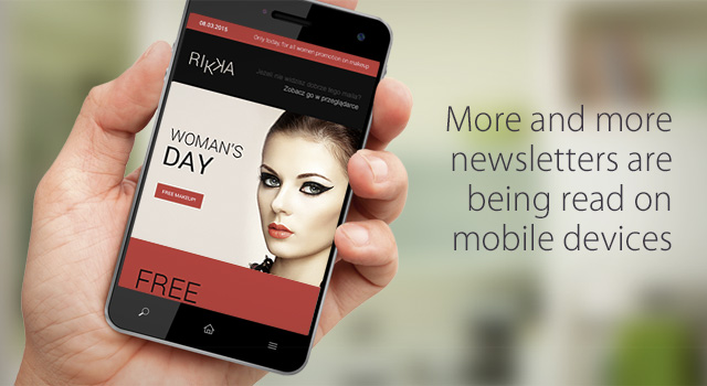
Research done by DMA UK indicates that around 50% of email marketing messages in 2015 were read on mobile-devices.
What's more, it is the fastest growing method of checking our email, so you should definitely keep this mind when designing and creating your email marketing campaigns - you can’t forget about the people who will see your message on the screen of a smart phone.
It is important to constantly monitor your reports to see how many of your emails are being opened on mobile devices. Remember that detailed statistics are always just a couple of clicks away and it’s worth the investment of time and effort to be up to date on how your subscribers are interacting with you.
If the statistics from your campaigns make it clear that you need to shift your creative strategy to accommodate mobile device users, this guide will lead you through the process.
2
Chapter
How are we checking our mail in mobile devices?
Chapter
When do we check our mail?
The way we interact with email when using mobile devices is very different than our “traditional” relationship with our inboxes, which used to be defined by desks, our offices and our homes. On smartphones and tablets, our interaction with email is now characterised by two motivations -
- The first is the need to kill time. We pull out our mobile devices when want a distraction to help us pass the time, whether it’s while riding a bus or waiting for a doctor
- The second reason concerns the inner need to be up to date, which drives us to check email on mobile devices while in bed - both right after we wake up and just before we go to sleep.

How do we check our mail?
We also interact with our email accounts in differently. Most of us simply scan our inboxes and this can be done in four ways.
- We can look through our inboxes for emails from people close to us and reply, as long as we don’t have to write too much
- We can scan for messages that are relevant to our professional lives, from a boss or a client. We typically reply to these mails straight away. If we can’t do that for some reason, we make it a point to get back to the message later perhaps by accessing it from a desktop computer.
- If we decide that the content of a message could be interesting for us and it looks well constructed, we can save this for an occasion when we need to kill time and we can go back to it. But again, only on the condition that content looks interesting.
- The last form of interaction with our email is when it’s time to clean up our inboxes. This is when we make quick decisions about what goes and what stays. Many of the messages that “go” are email marketing messages, so it’s worth thinking about how you can hold the attention of your subscribers long enough to give you a chance to get your message across.

3
Chapter
Subject or sender – which is more important?
Chapter
The results are in and the message is clear - the importance of the sender has taken on added significance in the context of email marketing and mobile devices.
The importance of the sender
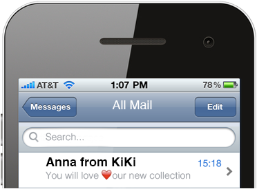
Most email programs installed on mobile devices devote significant space to the sender field. This applies primarily to iOS devices and newer versions of Android. This is yet another reason for marketers to take great care in protecting their reputation by always providing valuable content, not just advertising messages.
Source: computerworld.com
What should the sender name look like?
There are lots of different opinions regarding what the send name should look like. Do you communicate as a brand using your company name? Do you communicate as an individual using your own name or a combination of both? There is no hard data that supports a universal answer to this question - you simply have to find what works best for you through A/B testing from the very start. Read your reports and see what works best for you and your subscribers.
Message subject
The subject line of emails is typically not given much importance when displayed in mobile devices. They still affect the open rateOpen rate (OR)Procentowy wskaźnik, który pokazuje stosunek unikalnie wyświetlonych wiadomości do wiadomości wysłanych. but, again, everyone has their own ideas about what works best. Still, you should stick with proven strategies like -
- personalization
- using special symbols in the subject
- creating intriguing subject lines clearly related to the content of the message
- not using more than 5 or 6 words in the subject line
4
Chapter
Preheaders – the first sentence of your email
Chapter
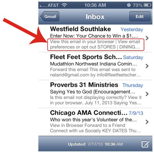
There is no longer any doubt about the huge role that preheaders can have in driving your open rates on mobile devices way up. The preheader is the first sentence in your mail and is displayed right after the subject line. Marketers often lose an opportunity here by placing a link to view the message in a browser -
“If this message does not display properly, click here…”
Now, this kind of link definitely has a place in email marketing, but it’s a bit different in the case of mobile devices because it diminishes the power of the preheader.
How to make a great preheader
The best idea is to use text that serves as an extension of the subject line and is directly related to the content of the message. It’s good to use a preheader that is directly related to the content of the message. Write the preheader in the smallest possible size, 1 px, and in the same color as the background so that it will appear in the inbox but won’t be visible in the body of the text.
5
Chapter
How to design a newsletter for mobile devices
Chapter
There are a few basic rules you have to follow when making an email campaign no matter if it’s seen on mobile devices or on desktops.
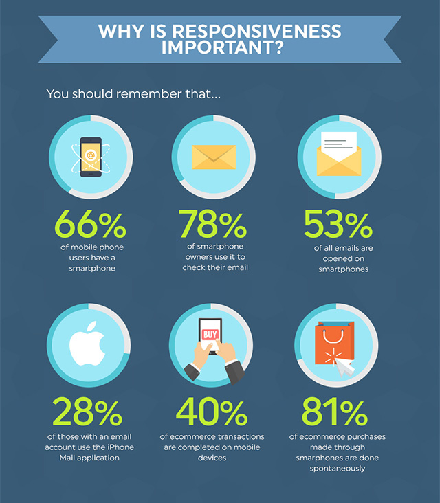
Research conducted by FreshMail shows that the number of people reading emails on mobile devices is growing constantly and a third of emails are now opened on mobile applications.
Rules to follow
- First of all, make sure your text is only as long as it needs to be. Keep it as short and to the point as you can because your readers are going to spend a lot of time reading. Most of them will just scan the message looking for something interesting or worthwhile so limit your text content to things that will hold attention.
- Use subtitles and a single-column layout.
- Don’t forget to include prominent call-to-action buttons so your subscribers can be easily lead to conversion no matter what platform they use to access your emails.
Remember that anyone reading your newsletter is using a significantly smaller screen than those using, say, Outlook, so it’s important to structure your message to be easily understood.
Typical characteristics for messages designed for mobile devices
Large font sizes
A good size for section titles is 30px but 22px is an absolute minimum. Text in the body of the message should use at least 14px.
A single-column formatFormat HTML + TXTWiadomość, która zawiera format HTML i TXT. Programy pocztowe, które nie będą mogły odtworzyć wiadomości w formacie HTML, wyświetlą ją w formacie TXT. Należy pamiętać, że wyświetlenie wiadomości w formacie TXT uniemożliwi zraportowanie jej w kontekście otwarć.
Single-column designs of not more than 520px work best for mobile devices. They are easier to read for subscribers and less likely encounter display problems.
A minimum clickable area of 44px x 44px
Remember that mobile users don’t have a mouse to help them click on things. They just have their finger to interact with your message and that finger needs a certain amount of space to click on anything. The recommended size for such an area is 44px x 44px but it could be as small as 44px high by 29px wide. Don’t forget that an empty space of at least 10px should surround clickable icons to make them stand out.
Clearly visible clickable elements
Clickable icons should be graphically prepared, placed on solid color backgrounds and be labelled with the action that they complete - “Buy Now”, “Read More”, etc. Make it easy for readers to navigate your newsletter since they don’t have a mouse to tell them if an element in clickable or not.
This graph sums up the highlights of this chapter of the guide:

6
Chapter
How do newsletters display on mobile email services?
Chapter
HTMLFormat HTML + TXTWiadomość, która zawiera format HTML i TXT. Programy pocztowe, które nie będą mogły odtworzyć wiadomości w formacie HTML, wyświetlą ją w formacie TXT. Należy pamiętać, że wyświetlenie wiadomości w formacie TXT uniemożliwi zraportowanie jej w kontekście otwarć. 5 and CSS 3 make it possible to create responsive newsletters.
What is Responsive Email Design based on?
Responsive design in email coding is essentially based on the idea of enabling newsletters to display differently in various email services. In practice it allows newsletters to adapt to the different standards of support for HTML properties found in commonly used email service providers.
This would not be necessary if email worked on a single universal standard but that’s not how things are. The marketplace is full systems and programs even though a few, like iOS and Android, dominate.
Supported capabilities for email clients on mobile devices.
| Android 2.x | iOS (Apple) | Windows Phone 7 |
Blackberry | |
|---|---|---|---|---|
| HTML Supported | + | + | + | - |
| Automatic downloading of graphics |
- | + | - | - |
| Increase text size (double click) |
- | + | + | - |
| Autoscale width | - | + | - | - |
| Scale font size | + | + | + | + |
Responsiveness in FreshMail
Every template created in FreshMail Designer is a responsive template. This means that before designing your template you should become familiar with the rules that govern responsiveness. A detailed list of thing that you should know can be found in our guide to using FreshMail Designer in the chapter about responsiveness.