 Marcin Kociuba
created
edited
Basic newsletter elements – how to make the most of them
Back to list of articlesDepending on what kind of business you run, you can use email marketing in different ways. Newsletters let you build relationships with your subscribers, transactional mails convey information, you can use autoresponders to share knowledge, build brand awareness and react to subscriber actions

Every message sent through an email marketing system has a defined, fixed structure that can be quickly reproduced. By paying careful attention to its various parts in the design process, you can ensure that your final message will be clear and easily understood. Let’s take a look at what to focus on when creating the content of your next newsletter.
Elements visible before the message is opened
The sender name and the subject of an email are important because they strongly influence the recipient’s decision to open the message or not. Everything about the mail should be clear before it’s opened - who’s wrote it and what the recipient can expect to see inside when it’s opened.

When designing these elements of your message, remember to:
- personalize the ‘from’ name - use a short name (2-3 words), make it easily identifiable (use first names and company names) and be consistent to make building a solid relationship easier,
- use the right title for the message - the point is to encourage the recipient to open the message in just a few words, highlighting the benefits of reading what’s inside. Be careful to avoid using words and phrases that will get the attention of anti-spam filters.
- make good use of preheaders - these are the first words that recipients see in their inboxes after the title of the message. Preheaders can be used in a variety of ways to make your message more likely to get opened. They can contain a call to action, another sentence to expand the title of the message, a mention of a key selling point, links to share content on social media or even an unsubscribe link are just some of the possibilities for the creative use of preheaders.
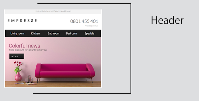
Header
The top section of your email is is the first thing that a recipient sees after opening it. Try to to use it to put the focus on the most important elements of your message. Headers can also be a good introduction to other parts of the newsletter.
Use graphics consistent with the visual identification of your site and place your logo in the upper left corner, where it is most likely to draw attention. Use one prominent call to action message so you don’t distract readers with too many small messages. Remember that you have just a few seconds to convince the recipient that take a look at the next part of the message.

When creating your message header, remember to:
- build a short and concise call to action using just 2 or 3 words,
- place your logo in the upper left corner of the message and make sure it is properly linked to your website or landing page. Also include ALT’s, alternative texts that display when graphics are not downloaded.
- use a navigation bar if your newsletter contains lots of content. This helps recipients to more easily move around and access the information they are looking for.
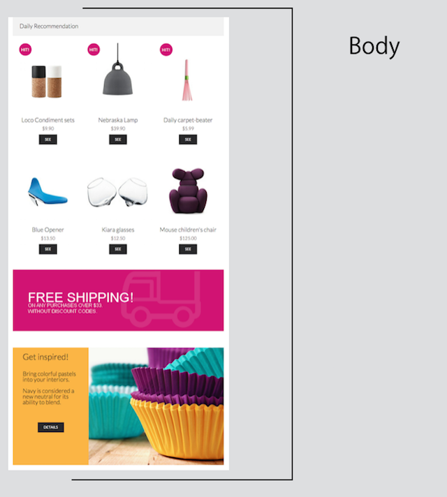
Body
This is the primary message that you want to share with your customers. The form will vary depending on the goal you want to achieve but one rule always applies - keep it simple. The recipient must immediately know what to expect from it. One email = one goal. Overloading information by placing several topics in one place will make readers feel lost and that’s the best way to lose their attention. Remember that most of us quickly scan the content of emails rather than carefully reading all of it.

When creating the body of your newsletter, remember to:
- use prominent calls to action in the form of large graphical buttons, corresponding to the remaining elements of the newsletter and the site you want to direct recipients to,
- try to visualize text message with graphic. Different kind of elements (text, graphics, video) make it easy for recipients to read.
- create an easily read layout with no more than 3-5 messages, visibly separated from each other. Including too many messages causes recipients to forget all of them and make it difficult to decide where to focus,
- use non-standard forms to increase the attractiveness of your newsletter with video, infographics, case studies, white papers, etc.
- optimize your newsletter for mobile devices - 53% of marketing emails are opened on mobile devices and that number is rapidly increasing.
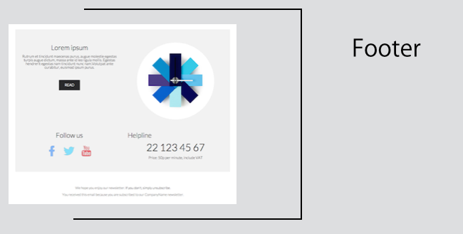
Footer
Let’s get to the bottom of things now and talk about your message footer. Footers are often overlooked by marketers, which is a huge mistake. In addition to the obligatory elements (contact details, email address unsubscribe link), you can cleverly use this area to help build the foundation of a lasting relationship with subscribers. Don’t make them too busy and remember that business disclaimers used in business correspondence don’t necessarily have to be used in newsletters.

Elements you should include in your message footer:
- contact information - in addition to the usual things, you can include a direct line to your customer service (often found in e-commerce), or links to your website (for B2B communication)
- business information for commercial companies - name, address and all relevant tax ID information necessary for issuing invoices
- your privacy policy, terms & conditions, contest rules - that is, all legally required information. Do not hide them on other subpages.
- unsubscribe link - not everyone who initially joins your mailing list will want to stay there. Make it easy to leave it by using a single link for those who do not want to receive messages from you. This is not only email marketing good practice, but it also builds trust between you and the recipient. On top of that, it allows you to keep your database of subscribers in good order - there’s no point in sending your message to someone who does not want to hear from you.
- social media icons - a newsletter can be the beginning of a relationship that can be enhanced by your social media profiles
- information about awards and distinctions received, testimonials from customers and anything that adds to your credibility as a business partner.

