 Marcin Kociuba
created
edited
Where to find design inspiration for your website and blog
Back to list of articlesLaunching a new website or blog is, undoubtedly, an exciting time – but to make that launch a success, you need to make a solid first impression. That first impression takes viewers just seconds to make – but countless hours to influence. And, beyond your actual text and services, there’s an even more important factor: your design. That design is your chance to get a good snap judgment – so make it count. But with so many options and so many ideas, where do you even begin? The answer is simple: with some solid inspiration.
Your inspiration can come from anywhere and anything – but sometimes finding it seems, in itself, an insurmountable task. Luckily, you’re not alone and there are great sources of inspiration all around you.
Find something you love
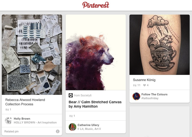
Your blog or website is (hopefully) going to be around for some time – which means you’ll be looking at it a lot. So you’d better love it. Pinterest is always a great source of inspiration – and for more than just dinner or arts and crafts time. Take the time to search for trending, industry-relevant boards – you never know what you might find, be it the amazing ceramic elephant that lands in your logo or the retro geometrical pattern that becomes your website’s backdrop.

Alternately, do some window shopping. You don’t even have to go in (all the better to keep your wallet intact). Just find something that draws you.
Find what draws your own eye
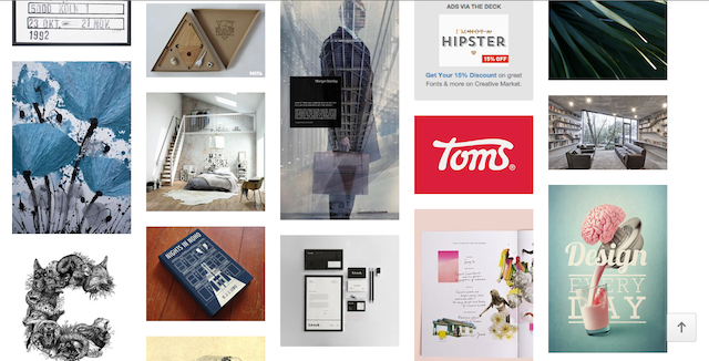
Be your own guinea pig – part of what your design needs to do is draw the visitor in; it stands to reason that if something catches your eye, it’s likely to catch your visitor’s as well. The best way to do this is to jump right into image city… or, as it’s better known, Designspiration.
The best part is, this exercise takes no real thinking or brainpower – it’s based in your own reaction. For example, looking at the below screenshot, what catches your eye? Go with your natural tendencies – then leverage them in your own way.

Find focus
It’s kind of design rule numero uno – find focus. Better yet, focus on one thing. That one thing could be a color, a shape, a design, an image – you name it – but whatever it is, stick to it. Too many components on a page competing with each other will drive anyone crazy. Find those few things that work together – and, if something isn’t a perfect fit, cut it… maybe you can use it in a later post.
Explore the genius of others
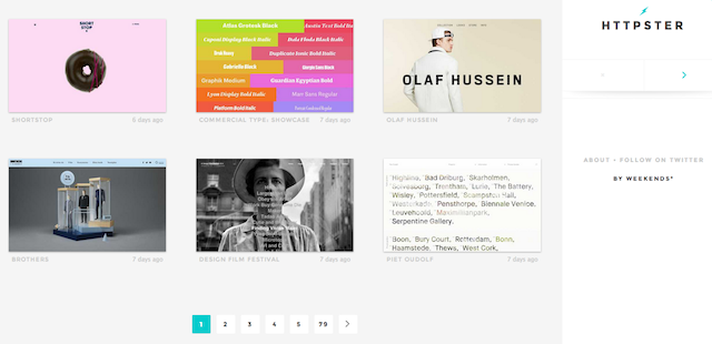
What better way to find inspiration than in others? There are plenty of sites out there showcasing recent work – HTTPster is one favorite. However, when you look, don’t look at something and think of how you can modify it. Explore what it is that you like about it – then consider how to take that one piece and make it your own.

Originality is key in every form – and, while inspiration is good, accidental copying can happen to you, too. In fact, stay away from your competitor’s sites – visiting them is the perfect way to accidentally make a near carbon copy… and what fun is that? Derive inspiration from ideas and concepts; not what’s already been done within your field. If you want to use a ready design for your newsletter FreshMail offers you free templates.
Really, inspiration is all around you – it’s how you channel and leverage that inspiration that will make your design a success. Be authentic, be yourself, and have fun.
More inspiration in our gallery of newsletter ideas.

