3 reasons why you should take a careful look at what’s above the fold in email design
Back to list of articlesIs the entire concept of a “fold” a relic of the era offline content? Should it still have an influence on the layout of your message? I’m going to ruin the surprise ending for you right now with the answers to those questions.
The fold is an important part of your email design and what’s above it definitely has an impact on the performance of your campaigns.
Now that the suspense is gone, you can focus on the reasons I give for paying special attention to the role the fold plays in your messages! Check why you should take a careful look at what’s above the fold in email design.

What is “the fold” and where exactly is “above the fold”?
Let’s start with the basics.
The fold is a term borrowed from the world of printed newspapers (remember those?). The fold was the space of newspaper cover that was visible after it was folded in half and put on display. It often contained breaking news headlines and content that drew immediate interest.
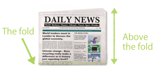
Today's reality is no different. Above the fold is the content that you can see instantly after opening a newsletter or website on any device without any additional effort. Of course it varies depending on the resolution of the screen, but the main function stays the same.
It should aim at attracting the attention of subscribers and encourage them to scroll down the page, see the substance of your offer and, most importantly, click some kind of Call-To-Action.
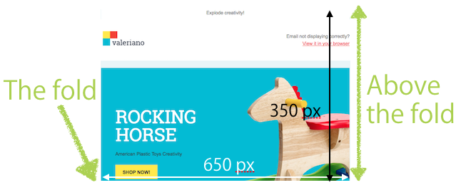
In email design, the above-the-fold area is about 350 pixels high and 650 pixels wide. This is the area that your subscribers see first after clicking opening any message. This area will be visible in most email programs without having to scroll down the screen.
Email - why you should carefully consider what gets placed above the fold
Content placed in this area has one primary goal, to encourage your recipients to read the rest of the message or to click on a link.
If it fails in this task, your campaigns cannot be successful so you have to view how you use this prime “real estate” very carefully.
A quick look at what surveys say about subscriber behaviour and CTR statistics will make resolve any doubts you might have about making the best possible impression immediately in your newsletter designs.
1. Subscribers don’t read text, they scan it
Don’t fool yourself into thinking that your subscribers always have the time or desire to carefully read everything you put into your newsletter. People don’t read online content the same way they read a book.
Nielsen Norman Group reasearch shows that we follow an “F” pattern with our eyes when reading internet content, including emails.

Source: Nielsen Norman Group
It’s clear that recipients don’t read the whole text but instead scan and skip parts in search of the information they want.
The good news is that this kind of research tells us that readers start above the fold and focus on headlines so you can be reasonably sure that if you put the right information in the right place, you have a chance at getting your message across.
2. Users spend 80% of their time looking at information above the page fold
Just because recipients can scroll down to read more of your newsletter doesn’t mean they will.
Part of your job is to give them a reason to and that means using the space above the fold to engage them and motivate them to put their scroll wheel to work.
Another Study by Nielsen Norman Group shows that for spend 80% of the time they read newsletters on content above the page fold.
The numbers don’t lie - anyplace where your customers spend 80% of their time demands extra attention from you.

Source: Nielsen Norman Group, The top black stripe indicates the page fold in the study. Red indicates where users looked the most
3. Shorter and shorter attention spans
Getting the attention of subscribers is becoming more and more difficult.
You probably already know that that your subscribers live in a world where they are constantly bombarded with advertisements and commerical messages.
They can receive an average between 3,000 and 20,000 marketing messages a day! We are all overloaded with information and the result is that we put up mental and digital walls to help us cope.
Remember that content above the page fold is first thing that your subscriber sees in the newsletter and it’s often the case that it’s the only thing they will see. This is your chance to get your message across.
Which elements of your newsletter should you place above the fold?
Remember that a well-designed newsletter has certain fixed elements that it needs to be effective:
- subject line - the first piece of information that subscribers see, its job is to convince them to open the message and read the contents
- sender name - this shows recipients that the newsletter isn’t spam and helps to show that the message is worth opening
- preheader - the first sentence email programs find in the body of a message, displayed after the subject line. It can be used to amplify the subject line or serve as a place for a call-to-action.
When creating your content that will appear above the fold, keep these three key elements in mind and be sure that your content supports what they refer to.
If you mention a promotion on a particular product or group of products in your subject line, show them prominently above the fold.
They should be visible immediately because when your subject line grabs the attention of subscribers and encourages them to open the email, they will be looking for what was promised.
There is no better way to help recipents evaluate if it pays to click the link or not. If you make a promise in your subject line, sender name or preheader, make sure you deliver what customers are looking for above the fold.
Again, you have an area about 350 pixels high and 650 pixels wide rectangle in the upper part of your newsletter that you have to use in the best way possible.
Make sure that you get all of these elements somewhere in that area. It’s not as much space to convince your subscriber to click “buy now” so keep mind that to maximize you efforts you should place this key elements here:
- your logo,
- a preview link,
- attractive graphics with properly formulated alts (the text under the picture),
- a call-to-action and an action button.

Your logo
Your logo helps subscribers to recognise the source of the message and it helps the message avoid looking like spam.
Branding the message with your logo helps subscribers to associate you with regular newsletters that they receive and, hopefully, look forward to.
Preview link
Remember that during its journey to email inboxes, various circumstances can cause your email to display incorrectly.
It also sometimes happens that subscribers simply want to view your newsletter in a browser window so make sure to give them that option with a preview link.
It’s enough to label your link “See email in browser”. Remember - preview links are your insurance against various technical problems that may prevent your messages from displaying in the way that you intended.
Pictures, please!
Professional-quality graphics are the best way to get and hold the attention of subscribers and quickly convey the qualities of your product.
They are also great at engaging subscribers and encouraging them to scroll down for more information and moving them towards conversion.
Pictures let customers instantly see what your offer is all about.
Call-To-Action
Sometimes your subscribers are ready to buy straight away so make it easy by including call-to-action buttons above the fold.
It’s important that you not make it difficult for anyone to find the link that takes them to the next step in your conversion process.
Take advantage of spontaneous desire and don’t make subscribers think twice!
Are you going mobile?
We all know that too many of us seem to be physically attached to our phones at all times.
This has resulted in a dramatic increase in the percentage of emails that are now opened on mobile devices.
It’s hard to determine exactly where your fold will be on various mobile devices but remember that you have access to proven tools that help you test your message and how it displays on phones and tablets before you send it.
Keep mobile users in mind at every stage in your campaign creation process!