 Karolina Gnat
created
The essentials of an effective landing page
Back to list of articlesIn a broad sense, any page a visitor to your website may ‘land on’ can obviously be called a ‘landing page’. For email marketing and ad campaigns, however, it is of paramount importance to design special landing pages, fine-tuned and personalised for their only purpose: conversion of the visitor into a client or a lead. Regular content pages of your website tend to be poorly fitted for that purpose since they have to offer something to everybody, to any random visitor who navigates to them.
Bear in mind the following cornerstones of building an effective landing page.
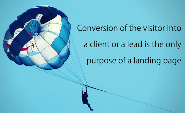
Focus only on conversion
A landing page has only one purpose: conversion. Leave out any distractions. Don’t make a visitor navigate through a complicated graphic arrangement - make it clear where you want them to go.
Segment by visitors
Make use of what you know of the people you’re targeting to show the right content to each prospect. Segment by demographic data as well as by the prospect’s history with you. Look at how Banana Republic clearly and neatly directs you to one of three catalogues.
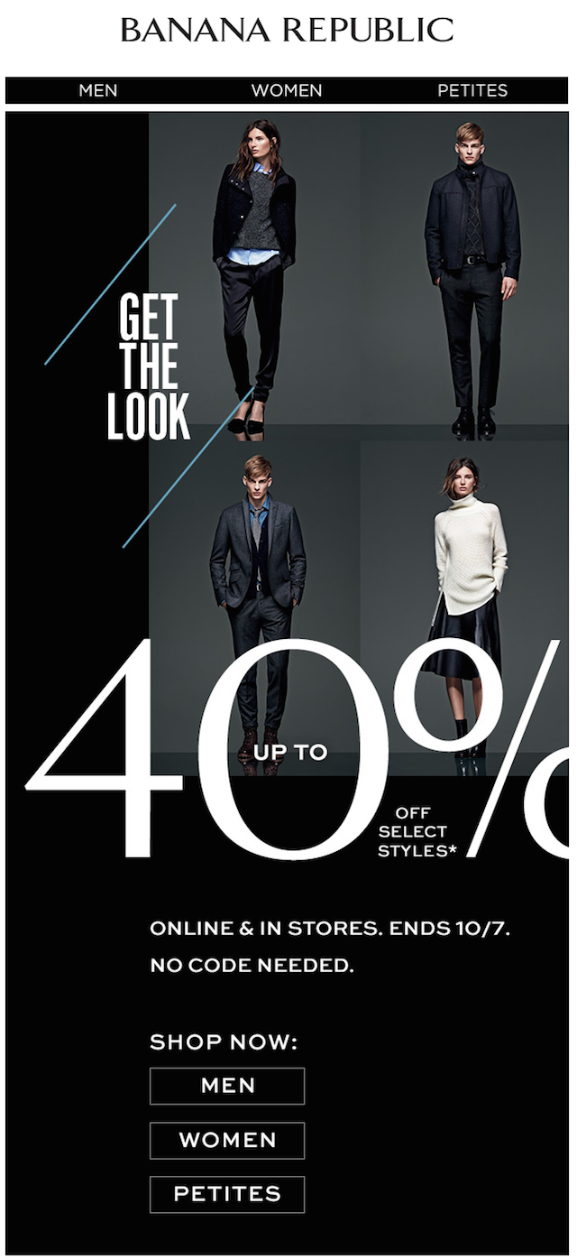
Newsletter: Banana Republic
Segment by channels
Show a different landing page to people coming through different channels. The recipients of your newsletter have likely already received more information from you than those who clicked on a banner; and those have seen something different than those who clicked on your text ad or on a Twitter link. Not only do you need to be able to measure the effectiveness of these channels separately, you need to be able to match the message already seen and to provide just the right amount of further details.
Match the message
The headline on your landing page needs to match what the prospect has clicked on, to reassure them instantly that they landed on the right page. Macy's has combined their many different departments into a simple graphic inviting you choose the one that suits you...
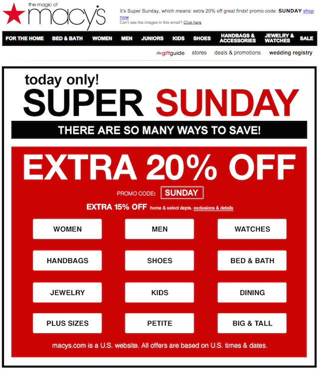
Newsletter: Macy's
...and then takes you right to the landing page to continue your shopping or browsing.
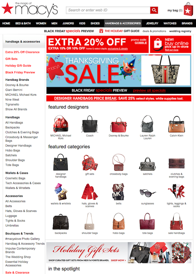
Landing page: Macy's
Provide core effective content
Follow the headline with further details. Briefly list benefits of your offering. Don’t forget a reinforcement statement and a closing argument. Make all the visuals point to a single call to action.
Illustrate context with images and videos
If you’re selling something, consider showing how it’s used or how it can benefit the customer. Note that studies have shown that videos tend to be markedly more effective than images.
Build trust
Appear in the video or images. Include your address and phone number in the landing page. Co-brand with trusted names and brands to build trust by association.
Cite authentic testimonials, not fake ones. The real thing will come across as more genuine.
Lower or remove as many risks for the customer as you can afford: provide free trials and/or money-back guarantee if it applies to your product.
Collect leads successfully
A lead-capturing page is a special kind of a landing page. It is typically built around a form to fill in. Remember: the less personal data you require, the higher the rate of conversion. Suppress your urge to ask for as much information as possible about the prospect. Only require what you need to follow on the lead; if it’s only an email address, only ask for an email address.
Improve your conversion rate by offering in return a gift relevant to the target audience and valuable enough to justify the exchange. Here's a great example of an attractive offer - just look at those prizes! - with a prominent 'Enter Now' button taking you to landing page to fill in your contact details.
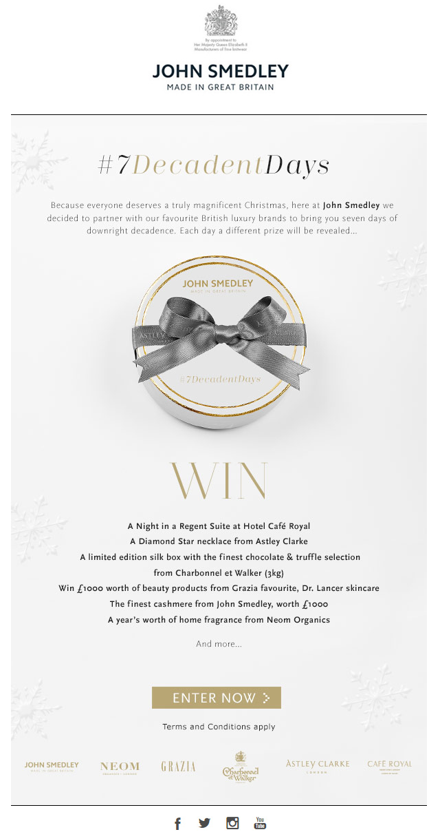
Newsletter: John Smedley
Look at how three simple questions are enough to get a valuable addition to your database.
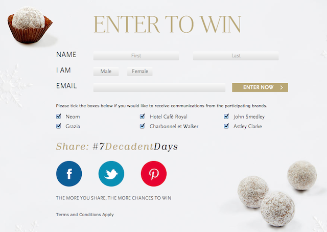
Landing page: John Smedley
Test and measure
While planning to build your first landing page using your experience and intuition, don’t stop there. Test variations and measure their effectiveness. Consider testing both elements of content as well as design. Test separately on different segments of prospective clients; nothing works the same way on everybody.

