created edited
How to build emailing campaigns and newsletters – eye tracking in email marketing
Back to list of articlesWhat do your eyes tell you about email marketing?
Do you know how important the layout of your newsletter is in order to boost your email marketing-driven sales? You are often in a dilemma as to which element to get rid of to make your newsletter more readable, well converted but eye-catching. Worry no more. You will find the answers in Edisonda's report: "Eyetracking in email marketing".
Results of the research
In May, FreshMail had the pleasure to invite guests from Edisonda to the M@il My Day conference where they gave a very interesting and inspiring presentation on eye tracking in email marketing research.
You can download the full research report here: full research report.
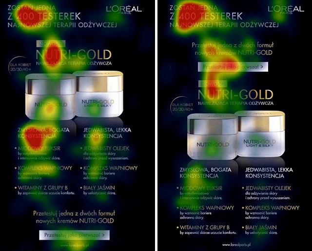
We read what's near the top
Readers' habits constantly evolve. Mobile devices encourage us more to scan a text rather than focus on the detail. We read selectively drawing an F on the screen with our eyes. This is why our eyesight tends to concentrate on large headlines and short paragraphs.
![]()
- we often don't pay attention to a text under the headline
- the higher the text is placed, the higher the chance that it gets read
- we should avoid placing important information near the bottom of the page
If you want people to look at the key selling elements, you should shorten the introductory paragraph to the absolute minimum. Also, it's better to put your slogan in a different color, in a frame and in bigger font or against a background.
A call to act on the product
It's highly important to properly lay key elements out on the page. People are used to seeing a logo in the top left hand corner and all attempts at changes in placing a logo may result in lower perception.
Call to action buttons should be located above the pictures of the products, which may seem peculiar as most marketers tend to call us to action after the product or service is presented. Here, it's worth carrying out A/B creation tests.

The number of columns doesn't have so much to do with the level of perception. However, if at least 8 percent of your target audience tends to use mobile devices to read such messages, it is better for you to keep to a maximum of two columns in your texts.
We like looking at faces
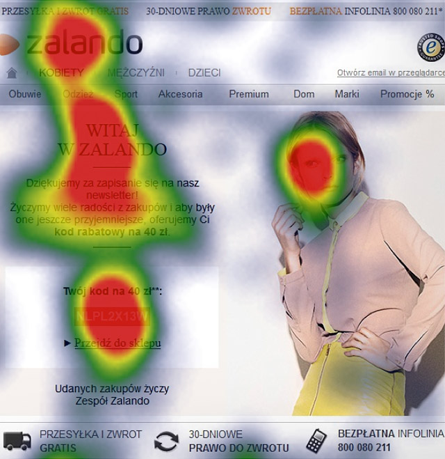
The emailing elements that always draws eyesight first are faces that convey information. Facial expressions and the direction of eyesight both have a crucial meaning. We need to choose pictures in a way that leads the eyes at what we want them to look at.

All kinds of arrows, even ones not necessarily directly pointing at where we should look, take our focus to the neighboring objects. Knowing this, and knowing to place call-to-action buttons above the product, will help you come up with an emailing idea that will engage your subscribers.
It turns out that empty space also matters a lot. You shouldn't distract your audience with unnecessary graphics and texts.

