 Marcin Kociuba
created
edited
Inspiring newsletters (part 1)
Back to list of articlesThe internet is a vast sea of inspiration for just about everything you can imagine and that includes email marketing. For some time now, we've had a section with ‘Newsletter Ideas’ on our website. We want to show that newsletters can and should be not only effective but also an attractive form of communication.
Now, we would like to present some of them on our blog and briefly describe what makes them good. Let’s get started with the first five newsletters!
Instill a sense of urgency
In this newsletter, a well-presented set of watches by Michael Kors is offered as a potential Christmas gift. The copywriter used a deadline to create a sense of urgency (‘The clock is ticking’, ‘Today is the LAST DAY to order monogrammed items...’). Moreover the power of suggestion is strengthened with references to free returns, gift packaging and rush delivery of presents.
One thing is missing, though. I can’t find a clear ‘call to action’ leading to landing page with the selection of watches. With that, it would be the perfect (or nearly perfect) Christmas newsletter.
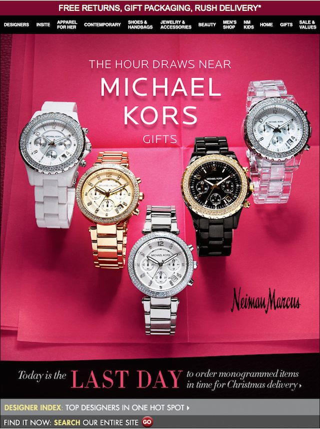 (newsletter: Michael Kors)
Create an interesting product or service and (almost) give it away
Checkmark is a smartphone app for the creation of to-do lists. Authors of this design neatly integrated the convention of to-do list with the image of iPhone displaying the Checkmark app.
Under the graphic we find the pitch - ‘For a limited time try Checkmark for just 99¢’ - and a contrasting but not pushy call to action (‘Get it now in the App Store’). If the possibility to try the app for free existed, I'm sure there would be a lot of takers.
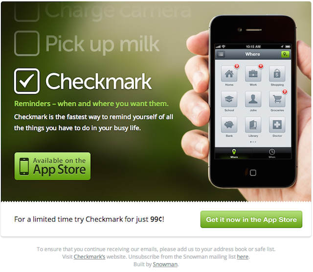 (newsletter: Checkmark)
Graphic personalization? Yes please!
Now this is what I call personalization! IndusInd Bank is a Indian bank and a partner of the national army. This newsletter presents a special offer for Senior Army Personnel - a bank account with additional benefits, a unique loyalty program, free helpline numbers and specially designed cards with military photos.
The offer itself is also highly personalized and the effect is even more powerful because of the fantastic graphics and slogan: ‘We take pride in serving’. This could be an excellent example of how to create a special campaign for other groups of professionals - lawyers, doctors, academics, etc.
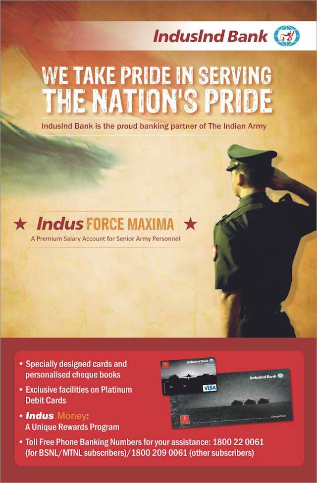 (newsletter: IndusInd Bank)
Don’t just sell products - show trends and give advice
Oasis Stores is a chain which for years has been very active online. This particular newsletter is quite old, but it is still a very good example of the perfect way of displaying clothes to women on in an electronic medium. The graphics can be fun to look at and engage subscribers on a fun level, which is a great foundation for sharing news about trends and tips.
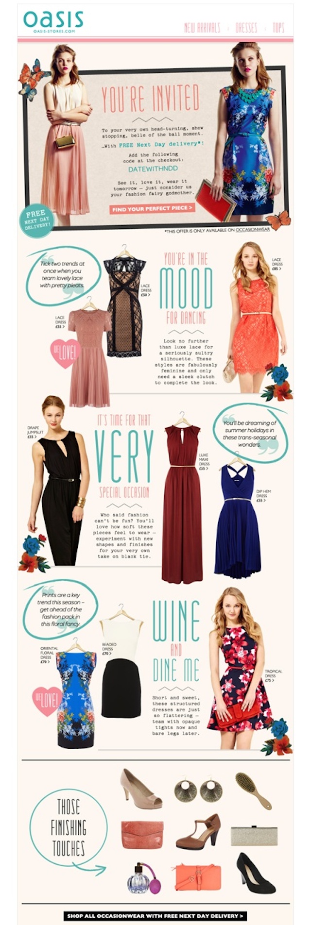 (newsletter: Oasis Stores)
Show your product the best you can (even if it’s just a piece of aluminum)
Not only clothes can be shown in an attractive way. Several tech companies, including DELL, have shown that technology (in this case a notebook) can also look great. This design introduces a modern ultrabook from every side focusing on its greatest advantage - its thin casing. To make the presentation of a simple notebook a little bit more dynamic, they've included a neat graphic of rolled aluminum (from which the ultrabook is made) and a background with orange fluid for contrast.
I haven’t seen many such an attractively presented computer. The message is also complemented with short descriptions of the main advantages of the notebook - its thin but durable casing, Corning Gorilla Glass screen and powerful processor.
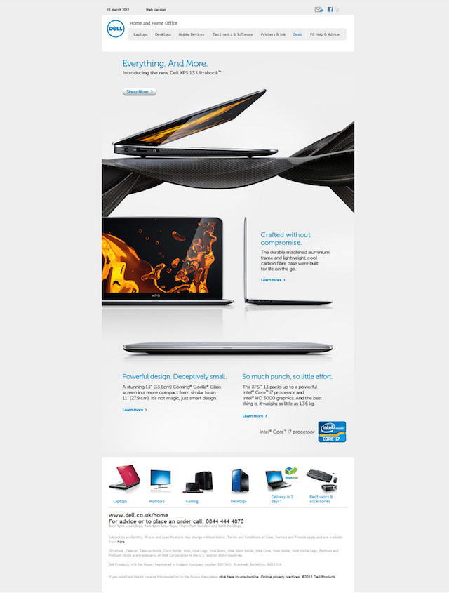 (newsletter: Dell)
Great newsletter templates for free
In FreshMail we design effective and attractive newsletters for our clients on daily basis. You will also find them in FreshMail Designer, where the work of experienced web designers waits to be modified and adapted to your preferences for every campaign you send (you will see for yourself how easy it is by reading our guide).

