 Paweł Sala
created
edited
How to build a content rich newsletter
Back to list of articlesEmail marketing is one of the most powerful and effective marketing tools commonly used to lead subscribers to your website, to shop and buy. Relatively inexpensive, a well targeted newsletter can create truly outstanding results. Unfortunately only about 4 % of people visiting a website are ready for an instant purchase. The vast majority need time to think.
In this article we want to show you how to build a positive brand image among your customers from the very first moment they see your newsletter waiting in their inbox.
Use eye-catching strategies to get your email noticed
From the marketer’s perspective there are three desirable goals to achieve while sending a newsletter campaign: getting the email opened, clicked through and the achieving an actual conversion. Let’s focus on the first element. There are three main elements that decide whether your email will be opened or simply ignored:
The sender – more than anything else, the name displayed in your recipient's inbox needs to be trustworthy and credible. The most common and reliable way to do this is to use your company’s name, your own name or a mix of both. There is no simple answer to the question of which one is more effective, it depends on your campaign, but you can run tests to find out what works best for you. Don't forget that a large and increasing percentage of all emails are opened on smart phones and a sender's name is much more prominent on mobile devices.
Subject line – it is essential to create short, snappy and effective subject lines. You can use personalization, special characters, an intriguing subject line which directly refers to the content of the newsletter and create lines which are no longer than 5 or 6 words. Again, testing is the key.
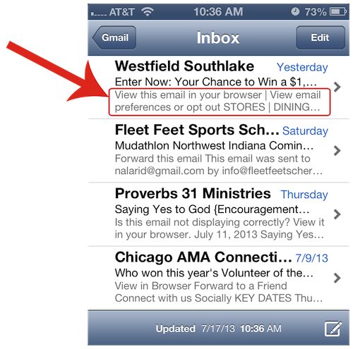
Preheader – this is the first sentence your email starts with. In some email clients like Gmail and Outlook it will be visible just after the subject line, so it’s absolutely crucial to get the message right, especially on a mobile device where it might work as a call to action.

Make a great first impression
You have only a few seconds to make a first impression so use this time well. When your client opens a message the first thing he will see will be the top of the newsletter. After seeing this small rectangle, sized 650 px per 350 px he decides either to scroll down or start looking for the 'delete' button. If you want to engage people in your communication you need to make sure that this crucial part of an email is designed to fit the purpose.
Be clear and specific
Carrying your brand’s online personality through to your email marketing campaigns is considered as a very effective strategy. Using the same font, style and putting the logo at the top of your newsletter will help your users to recall the brand (it will definitely work better than just sending plain text). A good habit is to put a short summary at the top (preferably in larger font as well) so when the user quickly scans for interesting information it's easy to find.
Make it scan-friendly
First of all, overcrowding your message with chunky paragraphs of writing is never a good idea. To make your text easier on the eyes and inviting, simply add white space in the newsletter which dramatically helps users to separate certain parts of the message when they jump around the newsletter hunting for something interesting. You can also use vertical lines to divide sections or play with the colored background of the individual items.

Keep it short and sweet
Until recently it was popular to send messages containing from 5 to 9 news elements. However, our experience shows that the best results can be achieved with much shorter messages. Research carried out by the psychologist Alan Baddeley shows that the human brain is able to process and remember only four components at the same time. Try to avoid covering too many topics and keep it simple.
Write an irresistible headline
Very often a user will read only the headline to get the information he needs. This observation is based on eye-tracking studies lead by the Edisonda agency. Remember that in a newsletter communication the a compelling headline has just one purpose – to get the next sentence read. For this reason best is to make it concrete and not easy to ignore.
Use images that take less time to understand than words
Remember this to create user friendly newsletters with graphics that directly communicate the purpose of the newsletter. Remember that placing an image on the left side is considered more effective (it seems more natural as we read from the left side anyway). Make sure you are presenting a good quality picture without too many details which may distract the reader.

Never forget that the human face has a powerful ability to connect. Using images of people whose sight is directed into the interesting section of the message can have surprisingly good results. It is scientifically proven that we will follow and look at the same section.
Put your well crafted call to action to work
No matter what information you want to put across remember that your newsletter should only lead to something more on your website. The call to action button is the component of an email that propels the recipient towards a conversion point, that is why it needs to be clear and direct. The common practice is to use graphic buttons that stand out immediately – which is even more important when your client opens the message on his mobile device.
Measure your success
Email marketing is the most direct marketing medium and can be used successfully to build a unique relationship. In order to gain this connection you need to create content which will get and hold the recipient's attention. The technology comes with very precise tools so the only challenge is to create and plan your own unique content. Good luck!

