 Renata Gajoch-Bielecka
created
6 creative examples of newsletters to be inspired by
Back to list of articlesAre you aware of the unsuccessful attempts of the Coyote of trying to catch the Road Runner in the famous cartoon?
This is what the marketer’s pursuit of creativity often looks like. The creature is very elusive ;)
So, if you are looking for an interesting newsletter design or want to improve an idea which you might have, this post will provide you with some inspiring examples of texts that have won me over with their creativity, graphics with that extra something and newsletters worthy of subscribing simply because they are done well :)
Below there are 6 inspirational ideas to help you catch that Road Runner!
This introduction will be razor-sharp...
Think about disposable razors. Do you think you can promote them through email marketing? If you think the answer is no, you're in for a surprise! :)
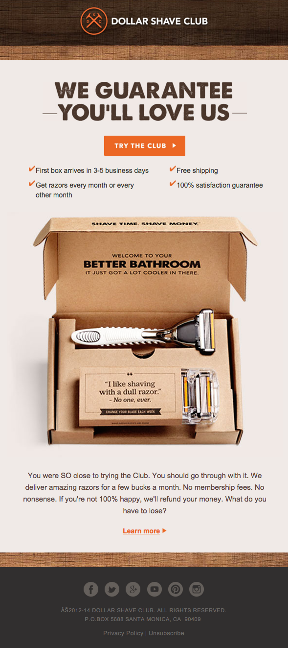
Dollar Shave Club (which, by the way, is known for THAT ad) has designed a beautiful, well laid-out newsletter. Take a look at the body copy – it’s so persuasive that only after I had subscribed to the club did I remember that I am a woman...
ProTip
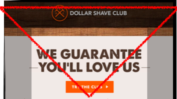
Note that the top of the newsletter, consisting of the logo, header and CTA button, forms an inverted triangle. Eye tracking research tells us that this is how most of us focus their gaze. With this simple trick, you can take your audience to exactly the information you want them to see.
Video in a newsletter
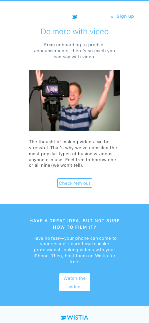
Wistia newsletters have a surprisingly clear layout for exceptionally condensed content. If lightness of design is something you are after, I recommend subscribing to their newsletter even if you are not their potential customer. And the another important thing is video in newsletter, which they use very often.
Unusual approach to standard newsletters
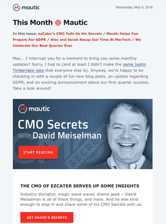
The newsletter below is a perfect example of creating an interesting standard newsletter containing several items of information from a corporate blog. Take a look at these few aspects:
- a set of links at the top of the page referring to the information that will be included in the newsletter,
- excellent body copy – “May... I interrupt you” is a neatly arranged sentence that grabs the reader’s attention (note that the newsletter was sent in May),
- look at the call to action (CTA) button – maybe you will also become tempted to breathe new life into the tired “Read more”.
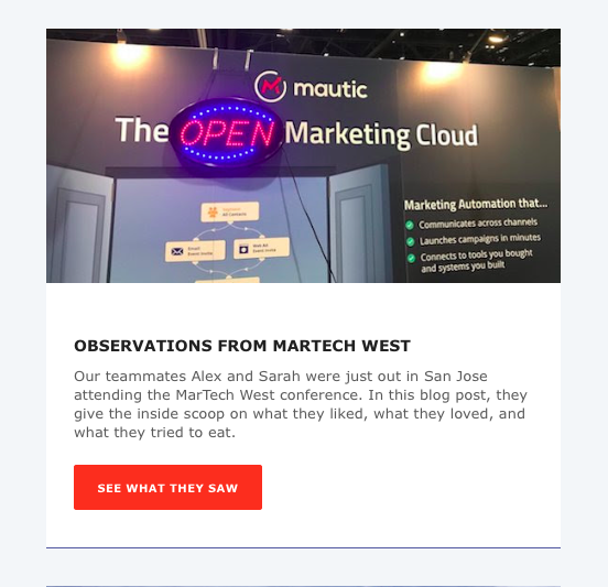
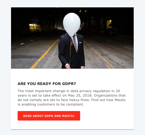
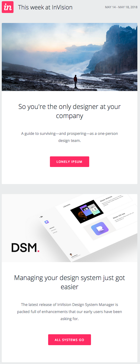
As far as CTA is concerned....
...the InVision content continues to stick in my mind. InVision newsletters deserve being read even just for their call to action messages. Not to mention their beautiful design and ethereal quality.
And one more example...

A real eye catcher of a design
If you are looking for inspiration on how to neatly combine eye-catching design and delineate blocks of information, take a look at Litmus newsletters. The graphics are perfectly matched to the condensed content.

Newsletters you can’t get enough of
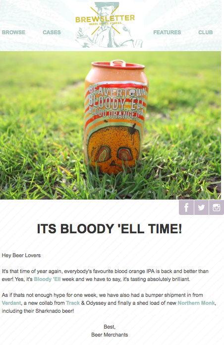
It goes without saying that writing about angle grinders is more taxing than creating content about something enjoyable. However, not everyone does their job as well as the creators of the Brewsletter. The new beer flavours are described in such a suggestive way that having read them you want nothing more from life but a well-chilled beer...
I hope you enjoyed the article and get inspired! :)

