 FreshMail
created
edited
How to make press releases more attractive for tech-savvy journalists?
Back to list of articlesThe way we were doing PR years ago is gone. Forget it. Yes, the goals are the same. And yes, media relations are still an important part of the public relations practice, but the growth of digital communications has changed how we pitch our stories. I mean, dramatically changed.
Of course, the basics are the same.
You still must have an outstanding and compelling story. It has to be well-written (I mean here a relevant structure and style), and it has to be valuable for the audience you are dedicating it to (read: do your homework, find out what they are looking for and give it to them).

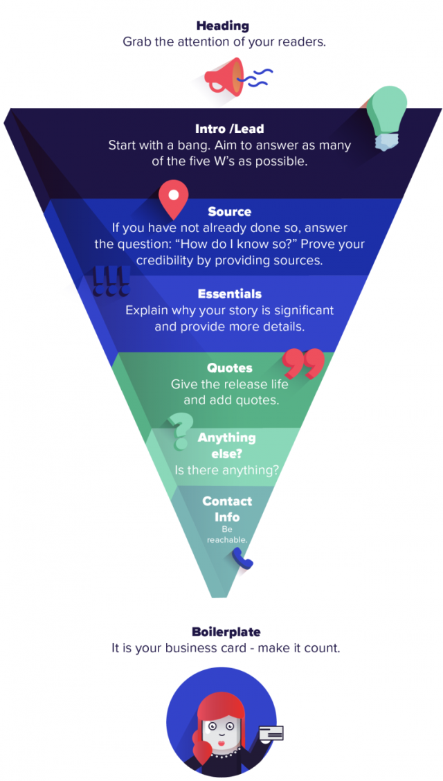
Pic. 1 The inverted pyramid approach to writing a press release
Now some don’ts. Having relationships with key gatekeepers still matters. But let’s be honest – writing the press release in a style that your client would like to write it (buzzwords) isn’t a tactic at all. Neither is making a follow-up 5 minutes after sending it out. Learn to listen and take to heart what journalists have to say. Today’s media inboxes are overflowing with news releases, and each one of them competes for the same eyeballs in newsrooms. That’s why standing out from the crowd requires finesse and clever packaging, particularly in this digital era.
Try different formats, play with multimedia
Sarah Shepard, Business Wire’s regional VP for New York, recently presented at Ragan Communications’ PR and Media Relations Summit in New York about creating multimedia press releases that gain traction.
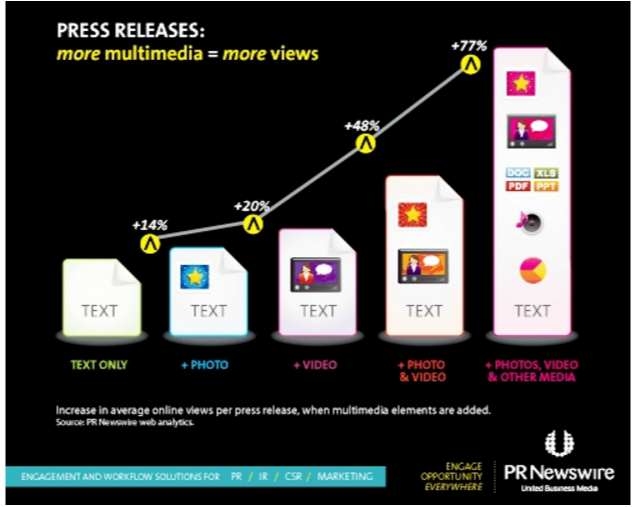
According to her, it takes 20 touchpoints to convert a prospect, so adding multimedia elements to press releases increases the odds of higher traffic and viewers taking action. As we already know, text-only press releases are less likely to break through the clutter. They are also less engageable than multimedia content.
People are simply far more likely to share your stories if they contain images, social media, graphics, audio clips or video presentations. They like visuals so much that multimedia press releases are shared about 3.5 times more often than plain text releases.
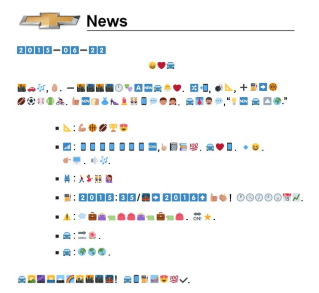
Just take a look at Chevrolet. Trying to appeal to a younger generation of buyers and announcing the 2016 Chevrolet Cruze, it introduced a press release composed entirely of emojis:

Pic. 3. Emoji press release by Chevrolet
BTW: grab a translations script here.
Here you have another example – a press release by ChildFund International. The nonprofit issued a GIF-only press release to support its annual Real Gifts catalog. You can find a translation here.
The goal? To find “a quirky way to draw attention to how people can give more meaningful gifts than traditional flowers and candy this Mother’s Day.” How do you feel about it? Quite extreme, huh? I agree. But it doesn’t mean you have to create a totally new language.
It just means you have to speak to them a little bit differently. Dry text doesn’t excite anyone nowadays. That’s why we changed our Story Creator by making it easier to pick the right GIF from the Giphy base (same with photos and social media posts or pitches) and drag & drop it wherever you want in your article.
Write for mobile first
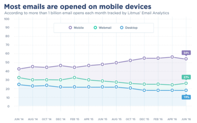
Smartphones and tablets can no longer be ignored by marketers. More email is read on mobile (55%) than on desktop email clients (Litmus, “Email Analytics,” March 2016)

Pic. 4. The ultimate mobile statistics by EmailMonday
See how to design a responsive email template in this INFOGRAPHIC!
Craft mobile-ready copy. Think short sentences and graphs, punchy quotes, and use micro content principles (you can list the main facts/5Ws as bullets, so they’re easily scanned on mobile). Why? To keep things simple.
“The screen size is very small. The network activity can go out at any time. Users tend to be in places where they don’t have a lot of ability to focus. As a result, we really have to simplify, prioritize, pick out the things that really matter – and that’s good for web design and good for business in general.” – says Luke Wroblewski (a designer who wrote the book “Mobile first”), quoted in Netmagazine.
#mobile copy: "pick out the things that really matter" @lukew @netmag Click to Tweet
That’s also very important for journalists and other influencers that get bombarded with messages fighting for their attention. For this reason, your PR pitch should be short and straight to the point. Especially the mobile one.
Don’t forget to include a call-to-action, use unique and trackable URLs and responsive design. The click to open rates are 40% higher for brands that exclusively send responsive content (Yesmail ,“Email Marketing Compass: The Season of Mobile,” 2015).
Always keep all content sharable
When possible, generate your press release content so it can be “broken apart” into pieces of mini content. Ask yourself, if your pull quote can stand alone and be tweeted or shared on Facebook? Can your graphic be shared with a cutline that provides the key facts? Can your video stand alone?
Create Tweetable headlines. The title makes all the difference – try to keep it to about 100 characters or less. Make sure your press release always has social sharing buttons when it’s published online so that readers can click the button and share your story to Facebook, Twitter, or wherever else.
Create cobblestones and cornerstones
The theory of cornerstones and cobblestones (by Tom Martin) encourages you to think about your content marketing in terms of several blocks of content. For example, if you’re going to create a whitepaper (cobblestone), can you also create a series of related blog posts (cornerstones) that incorporate pieces of data from that graphic?
As you begin to put more multimedia into press releases, don’t let it be a one-time use. Instead, repurpose that content in other ways to strengthen your overall content marketing strategy. To do it, you need a plan to distribute your content via the journalist list you’ve developed over time. And it’s obvious that you will not do it manually. Not in the digital era. It’s time to bring in the tools for content distribution to maximize coverage and make sure your content is actually seen.


