 Maria Wąchal
created
edited
Newsletter ideas with Pantone 2016 colors of the year
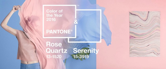
Back to list of articlesEver since PANTONE started announcing their choice for Color of the Year, manufacturers, artists, designers and marketers have tried to immediately integrate them into their products and projects. And if you haven’t heard, two colors are sharing the title of Color of the Year for 2016 - Rose Quartz (PANTONE 13-1520) and Serenity (PANTONE 15-3919).
So is it worth trying to work these colors into your email marketing? Of course it is! It’s especially worthwhile if you operate in fields like fashion, weddings, beauty, interior decorating or design. Use this opportunity to show your subscribers that you are up with all the latest trends.
How marketers can benefit from PANTONE colors?
PANTONE is the authority on color, provider of color systems and leading technology for accurate communication of color. Since 2000, their annual declarations of the “in” colors has become a huge cultural and media happening as well as big news for producers and consumers. These days, the announcement even impacts buying and manufacturing decisions in lots of industries.
The event has become an inspiration for designers and marketers who take advantage of the opportunity to promote their products and tempt consumers to make more purchases. Right after this year’s announcement, Rose Quartz and Serenity were featured by brands like KitchenAid and Sephora.
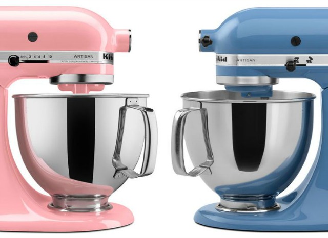
KitchenAid products inspired by 2016 colors of the year
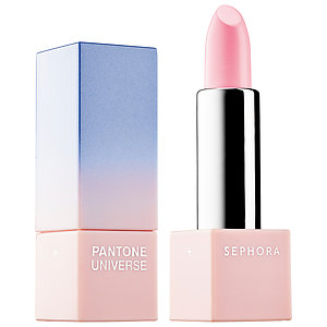
Sephora PANTONE UNIVERSE
The publicity surrounding PANTONE’s “Color of the Year” announcement has grown year by year and is a major event on the design calendar. Pictures of products, clothes, cosmetics, furniture and tons of other things in the hot colors flood the internet. Big brands use their marketing muscle to become trendsetters.
This means that the increased exposure of consumers to products from recognized brands in the chosen colors results in a gradual acceptance and then preference for the promoted color schemes despite a wide range of other possibilities available. This year, even hair stylists didn’t miss a chance to join the buzz around #PantoneColorOfTheYear.
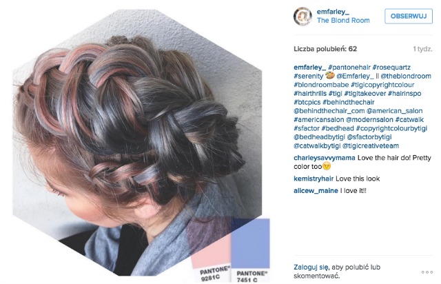
What stays behind PANTONE's choice for 2016?
Before the announcement of the winning colors, the PANTONE Institute considered the opinions of fashionistas and pop culture insiders including those in the film and music scenes. In 2016, for the first time ever, instead of just one winning color PANTONE chose two to share the title. According to PANTONE, they represent balance and peace and two factors influenced the decision:
- consumers are looking for mindfulness and a sense of well being as an antidote to the stress of the modern world and these colors deliver a feeling of comfort and security
- we are experiencing a gender blur as it relates to fashion. A diverse, updated approach to colors in which pink is not reserved for girls or blue for boys is increasingly apparent in trends and consumer behavior. We
Newsletter ideas with Rose Quartz and Serenity
We already know that we buy with our eyes. Of course we all check things in more detail and read descriptions but the final buying decision usually comes down to what we can see in pictures - and colors. Always remember this when arranging the display of your merchandise. Put an accent on trendy colors and use this “colorful” occasion to surprise your subscribers.
Look at what DENY Designs did in their newsletter right after the color of the year announcement.

DENY designs Pantone newsletter
Show your customers that you know the latest trends! #RoseQuartz and #Serenity #coloroftheyear #2016 in a #newsletter Click to Tweet
How to incorporate Rose Quarts and Serenity into your newsletter with FreshMail
FreshMail always makes it easy to create beautiful newsletters. You don’t have to be a graphic designer or have advanced programming knowledge to make your own newsletter templates and set every detail to your liking.
Using FreshMail Designer just choose a template and customize it to suit your needs. You don’t need any outside programs like Photoshop to edit any graphic in every way imaginable: use cropping, set the transparency, adjust shape and placement, add graphics and text as layers.
Look at the example below to see how easy it is to change the color of the background in FreshMail Designer. You will find the exact color standards for Rose Quartz and Serenity on the PANTONE page. To select them in FreshMail Designer use HTML values for TCX.
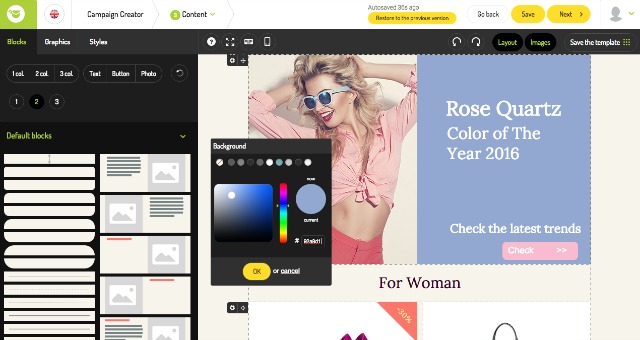
FreshMail Designer - newsletter idea with PANTONE colors of the year
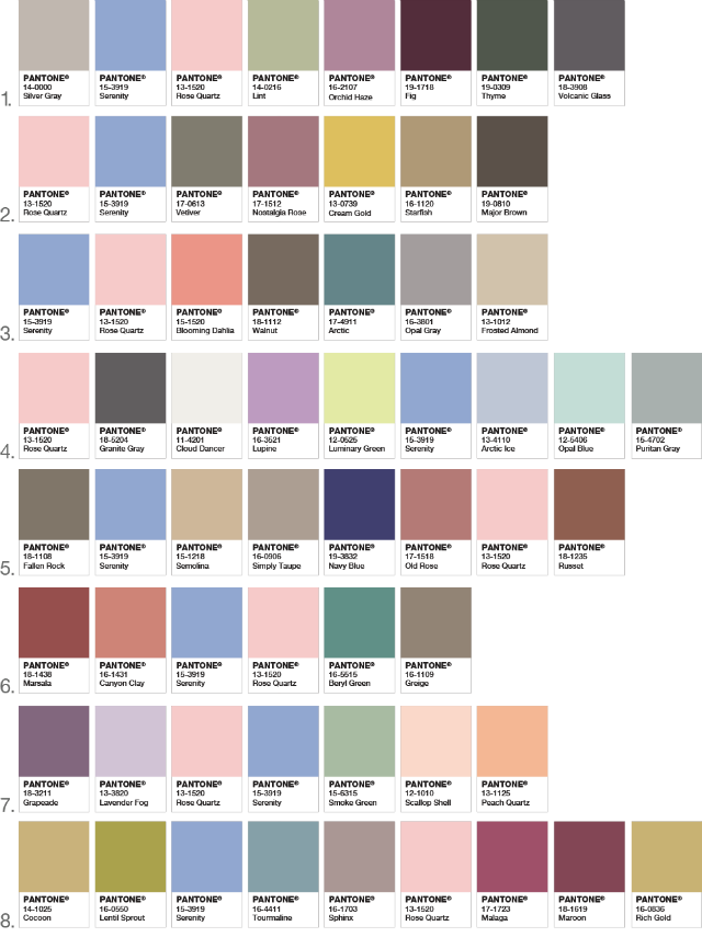
Additional color schemes
You don’t need to persuade women to use powder rose or light blue but do these colors speak to men too? For the sceptics, PANTONE suggests a color scheme which tones the overly cute pastel touch.
Remember that Rose Quartz and Serenity are ideal for little extras and accents for a more vibrant combination of colors. They are very subtle and perfect for when whispering instead of screaming is better for getting attention.


