 Eliza Gniadek
created
edited
The psychology of the Call to Action
Back to list of articlesI’m sure you already know what a call to action button is and you might even be familiar with the best ways to create and use them. In this article I want to talk about a few of the most important aspects of the call to action button creation process - understanding the way people perceive texts and graphics, the psychological rules that stand behind the process and how to use them to your advantage.
Let’s start from the beginning: CTA (Call to Action) buttons link subscribers to external content (a landing page), calling on them to take some action. You can link buttons, text or pictures. Your aim is optimizing conversion - you want people to click the CTA, see the offer, buy a product, sign up to your database etc. Take a look at these golden rules to follow if you want to give your call to action that extra element of persuasion that counts for so much in email marketing campaigns.

Golden rules
- Choose the most noticable and prominent CTA, usually a graphical button. If you want to link text, make sure the text is distinguished from the rest of the body of the message and it’s clear to everyone that it’s clickable. Use an appropriateicon after the description e.g.: Buy now>>
- The color of the CTA should be different than all the other colors used on the website. Take a look at the Facebook registration page - it’s all blue apart from the green sign up button. You can be sure that this was the result of careful deliberation and testing!
- The copy on the button should really be a “call to action”, so it’s a good idea to use the imperative grammatical form: sign in, try it, come closer, buy now etc. Of course all those phrases are very popular and commonly used so you can try to be more original if you like, referring directly to the body of the offer, e.g. Try for 2$ only >>
- Tell your subscribers exactly what you want them to do, using language which activates subscribers and clearly indicates what the particular benefit is.
- Make the CTA obvious and easy to identify - design the button in such a way that your subsribers won’t have any doubts about what it is and what will happen if he clicks it. Make the button look like a button - this is not the time or place for guessing games about what the subscriber needs to do to get what he wants! Remember to use a proper a familiar shape that makes it clear that you should press it. Just like a door handle - if it’s designed in the right way, you shouldn’t have any doubts, if you should push or pull and no instructions are needed.
- The CTA button should be located in a logical place. First you have a chance to read about the offer and then you should have the opportunity to click if you are interested in seeing more details.
- The CTA button should also be noticable, sticking out from the background.
- Speaking of the background, nothing should distract your subscribers from the button so use an empty space around the CTA and don’t use other graphic elements with a similar shape or color.
- You can also try additional effects, e.g. hover for CTA. This is when the mouse pointer is held over a CTA and without clicking changes its layout.

A wise marketer avoids...
If you stick to the rules above, your CTA should be perfect. But just in case a few warnings to prevent you from making mistakes when you try to make it too perfect and end it doing a bit too much.
- Don’t use too many CTAs in one email! Make sure the subscriber knows exactly which one is the most important CTA and leads to the dedicated landing page. If you do have multiple CTA’s, use size to vary the importance of the buttons.
- Don’t link to your main page. The landing page should be the extension of the offer in the newsletter. If you promise your subscriber that he will find more information after clicking then make sure you keep your word!
A newsletter below is a great example of good CTA. here is only one button which is distinguished by its color. Second, the CTA leads to the landing page where you can buy the same clothes featured in the newsletter.
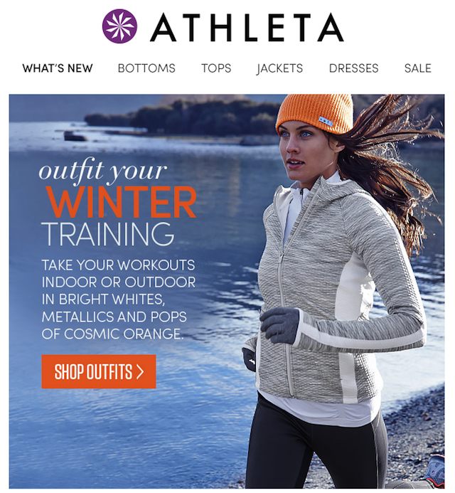
Newsletter: Athleta
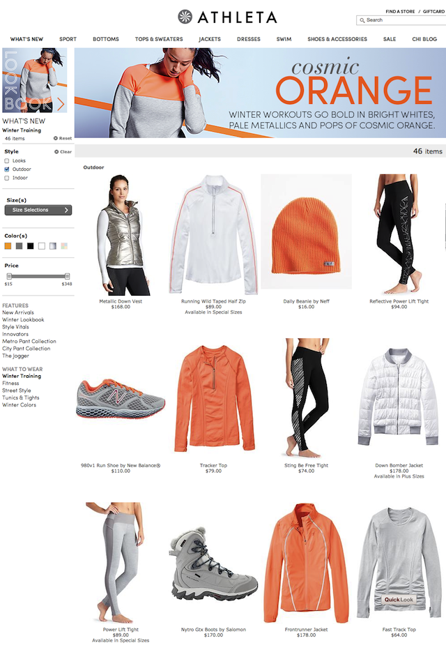
Landing page: Athleta
The psychological background
So now that you know the technical aspects of creating a CTA, it’s time to analyse the reason why it works so well. Psychology drives just about everything we do and its influence affects CTA’s too!
- We pay attention selectively, only scanning emails, so you have to know how to attract attention of your subscriber. A field with a small amount of text is perfect for it - focus the eye on a particular, distinctive element that stands out from the plain text.
- The human brain is innately curious about what’s going to happen next. Use this curiosity about CTA’s! People need to discover and explore, so they will also try to find out what will happen after they click CTA. Make sure that their choice is validated by your offer.
- Curiosity can be even stronger if you reinforce it in the right way. Try to arouse a desire to uncover secrets. Try words like “tips and tricks”, “secret”, “see our guide”, “get a free….”. Explain some part of the secret but not everything, promise a discovery, or give the subscriber access to some hard to find information.
- Psychology has a lot to say about our “psychological sense of reward”. In the past we received rewards for certain actions like clicking a CTA. The sense of pleasure that comes with receiving such rewards is now associated with other CTA’s and now it’s easy to believe that the same action will lead to the same reward. Use language that outlines the reward or benefit to take advantage of this.
Most importantly - when designing something for clients, always try to look at it from their perspective, not yours. Something that is obvious for you is perhaps not so clear, useful or tempting for others. Show your project to someone from outside your company - if they understand, it means you are on the right track towards meeting the needs of your clients.

