 Marcin Kociuba
created
My war with Outlook…
Back to list of articlesEvery coder who creates newsletters and email campaigns will, sooner or later, lose his mind.
The reason?
Microsoft Outlook
I can’t even remember how many times during my work that I’ve said to myself “Ok, everything looks great… wait second… something in Outlook isn’t right”. I’ve spent way too much time and energy trying to identify problems and find solutions so newsletters would display properly in Outlook.

So what’s causing the problems in Outlook?
In an earlier version of Outlook the rendering engine of Internet Explorer was responsible for the look of emails but in 2007 Microsoft introduced a significant change. To better integrate its email service with the rest of the Office suite of programs, Microsoft brought the rendering engine of Word to Outlook along with all of the pluses and minuses attached to it.
Word is not a program for browsing internet pages but a text editor so that means it has certain limits for accepting HTML or CSS code from Outlook. You can see this reflected in the differences between its 2003 and 2007 versions.
In the CSS report, you can see a clear drop in the support for CSS in Outlook 2007 compared to Outlook 2003. We can complain about it but of course this was the result of the decision of the people in charge and the coders were just doing what they were instructed to do. Oh, well.
My list of Outlook’s sins
Email width
This particular complaint arose during the development of a project I worked on. The newsletter was supposed to be dynamic with the use of a very broad picture and things were going well…

...until I ran an inbox test for Outlook. Everything was heavily compressed, in spite the fact that I had defined the dimensions.

I stared at it, thinking about what could have possibly caused the error. This turned into an in-depth analysis of everything and what we found surprised me even more.
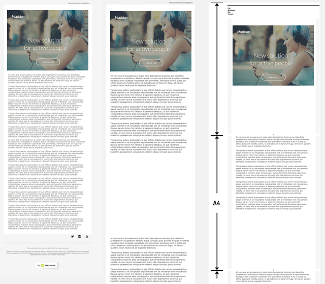
It turned out that, because Outlook uses the Word engine, it has a default size of A4. That means that the maximum width can be about 2000px and anything beyond that gets cut out.
Email height
After fighting with Outlook over the email width, I thought the surprises were over. The next problem started out innocently enough - breaks appearing between blocks of texts. I checked the code and everything was fine. So I ran a screen test and again everything was as it should be. So what was the problem?
Experience with problems related to the width of emails turned out to be helpful and turned out to be a good place to start the investigation. Again, A4 is the default size in Word but that did not explain the gaps in the text. I decided to print the email to see if that would tell me anything, and that turned out to be just what I needed to do to crack the case.

Well, ladies and gentlemen, here’s the bottom line. Outlook e-mail messages in inboxes display as if it they were a text file, ready to print in an A4 format but that’s not always how you want a message to display. If the spacing of your text does not match the dimensions of A4, then guess who’s going to win the fight - Outlook or you? For the longest time, Outlook could not cope with the appropriate arrangement of the content because of this error and it was only fixed in Outlook 2013!
Borders
Another cause for frustration. When using frame elements in your newsletter you should remember that Outlook only supports border widths of 10px. Thicker frames are tapered, causing excess space, which may cause a scattering effect on your design.
GIFs
A universal problem but still irritating. Using a gif in a newsletter means that you have to count on Outlook to display the first frame of the animation. The recommended procedure is to create a gif in such a way that the most important information is shown in the first frame.
Support for CSS
Web-based email applications are always being expanded and updated, making it easy to take advantage of new technologies as they become available. Outlook, as a desktop program, is more resistant to changes and improvement.
Currently you can find Outlook 2003, 2007, 2010 and 2013 in use. The older versions are not very advanced at all, which is illustrated by the fact that in Outlook 2007 messages have been displayed in the same way for 8 years - and 8 years on the internet is like 100 regular years. Furthermore, as you can see from FreshMail’s CSS Report, developers at Microsoft don’t really want to develop the support properties for CSS in Outlook. I guess they have their reasons…
The bottom line
Unfortunately, what I’ve listed here is just the tip of the iceberg. There are lots of other minor problems like replacing the <div> with <p> or a paragraph with default padding and margins that can spoil the whole layout template. A lot of the problems in this particular case have been resolved, not by the creators of Outlook but only trickery, evasion and the use of additional code by people like me.
I wanted to end with a positive comment but I can only finish by saying that the only option worth using on Outlook is “uninstall”.
Signed,
Lukasz, the Front End Developer with Outlook-phobia

