 Marcin Kociuba
created
edited
What you need to know about responsive templates in FreshMail
Back to list of articlesFreshMail Designer has been enhanced with a new functionality - responsiveness. Now, every template you create is a responsive template. This means that the device that the subscriber is using to read the message determines how it will be displayed. Responsive technology lets us be sure that emails will are properly displayed at different resolutions on a variety of computer and mobile device screens.

Responsiveness and email programs
The full responsiveness of web pages is universally supported by internet browsers. This kind of support from email service providers, however, can vary quite a bit. The primary reason behind this is a somewhat complicated process of building messages on tables that are not the ideal basis for a fully responsive content.
Projects created in FreshMail Designer display correctly thanks to code embedded in the editor that deals specifically with the issue of how they are opened by particular email service programs. Different degrees of support for CSS properties - and even sometimes a total lack of support - from email service providers means that templates must be built with coding that has a unique and complicated structure. Constructing them in this way is meant to ensure that all subscribers will be able to view the message as it was intended regardless of the email service they use.
What you should know when creating responsive messages
Achieving the desired results depends on the proper construction of the template along with following a rules. Remember that more than anything else, responsiveness depends on using a single-column construction for smaller devices.
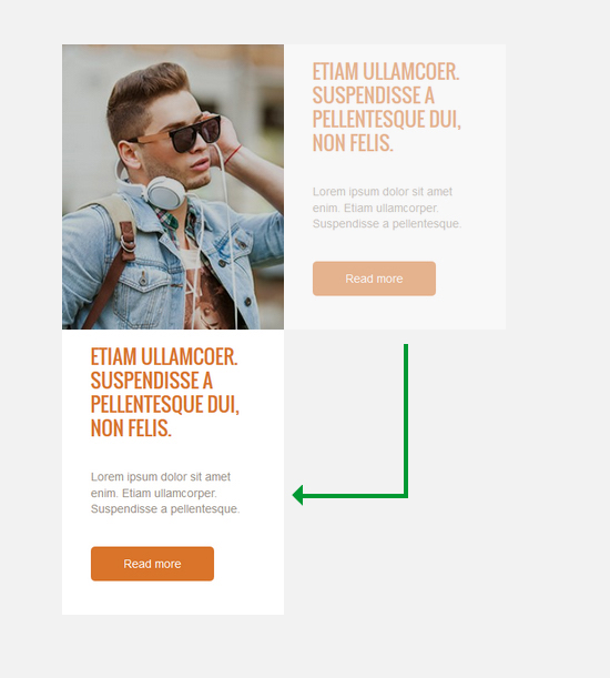
The breakthrough point is moment when the template switches to a single column format and happens at a width of 480px.
The template always breaks at the edge of particular blocks and the place depends on the number of cells in the block. This example shows what the breakthrough looks like in a two-cell block:

How do graphic behave? And what about additional elements like rounded edges or spaces?
A detailed list of things you need to know when designing a responsive template can be found in our guide to FreshMail Designer in the chapter about responsiveness.
Adding responsiveness to a template
Non-responsive templates created in FreshMail Designer can be recreated with responsive properties by importing the template into the editor and saving it as a new template. The code of the template will be changed automatically.
Why is responsiveness in emails so important?
Here's a piece of our infographic showing the importance of desinging responsive emails:

Check out the full version for tips on how to design emails that will be perfectly displayed on mobile devices.

