 Eliza Gniadek
created
Black Friday Campaigns that are irresistible
Back to list of articlesWe all know that Black Friday is one of the most important holidays for the eCommerce market. According to Adobe, the UK’s Black Friday’s purchases will generate more than £900 of online revenue this year.
Numbers like mean that eStores need to put their marketing strategies in top gear and be ready take advantage of the frenzy by driving as much traffic as possible to their websites and converting that traffic into sales.
You can find some great tips on how to plan eCommerce strategy for Black Friday in another of our recent articles but today we’re focusing on 10 examples of Black Friday email marketing campaigns that are irresistible. Who knows, you might find just the inspiration you need for your own campaign!
Ready, steady, go!
Black Friday is a race and, believe me, in this competition the winner gets amazing prizes. Preparation starts well before the big day so give yourself plenty of time to send a reminder about the upcoming deals and give customers a sneak peek at what you have in store for them.
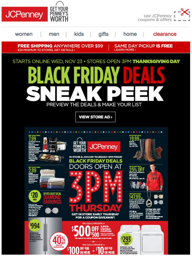
That’s what JCPenney did. We got this email on November 5th, a good three weeks before Black Friday. The message encourages us to start planning purchases and make a wish-list.
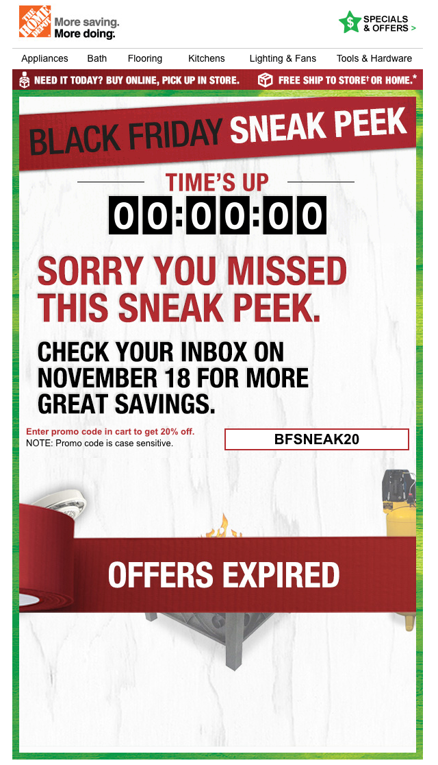
Or you can prepare a special Pre-Black Friday promotion like The Home Depot did. They arranged an interesting series of one-day sales. Subscribers got messages with a code that gave them 20% of selected items. The cool thing here was a countdown clock that ticked away the time left before the offer expired. Its job was to create a sense of urgency persuade subscribers to visit the store sooner rather than later. When the time ran out, a “Time’s up” message was displayed along with a reminder about the next upcoming offer.
Get attention
Our eyes are automatically drawn to things that move. If you want to catch a subscriber’s attention, consider using moving pictures in your campaigns. One of the best ways to use them in your email marketing is with gifs.
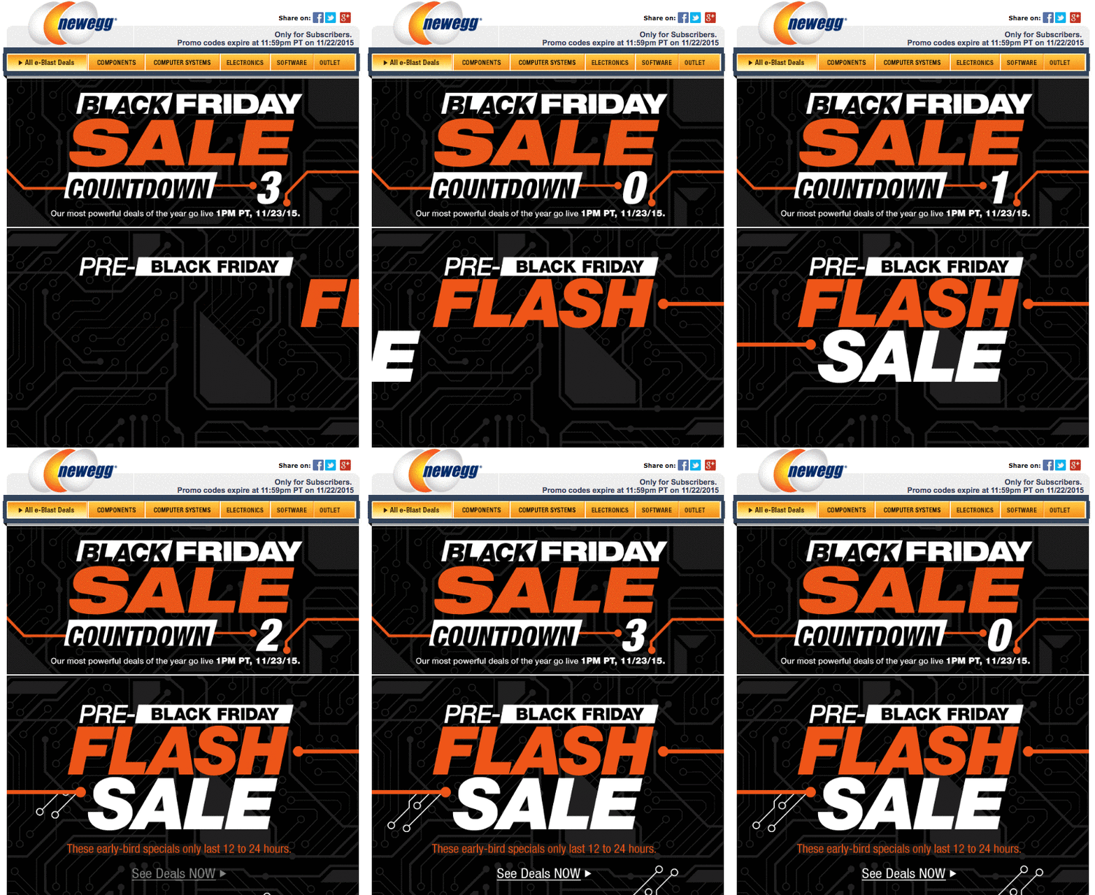
Take a look at the example below. This Newegg campaign is pure movement. Most of the content in this email is animated. The black background suggests Black Friday. In the combination with contrasting text it makes the campaign really eye-catching.
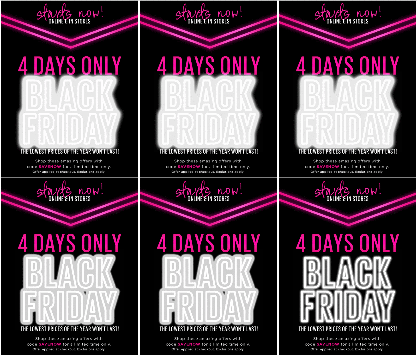
Here’s another example. Just like Newegg, Saks Fifth Avenue uses a black background and contrasting colours. In this campaign the most eye-catching thing is the neon and animated Black Friday.
Use personalisation
According to FreshMail’s own research, using personalisation (name) in the subject like can improve average Open Rates by up to 126%!
By using personalisation you can make your subscriber feel special. You’ll show that he is important and all your communication is dedicated to his needs.
So if you have information about your users’ names, use them to personalise your campaigns! You can personalise the subject line, preheader and text in your email campaigns.

Be simple and clear
If you want to focus on the central point of your communication - the essence of your special promotion - use a clear and simple email template.
These days most of us scan more content than we read. We usually sift quickly through the text looking for large numbers, bullet points or paragraphs. That’s why you should focus on the most important information in your Black Friday campaign. Don’t distract your subscribers with irrelevant details and get to the point! Remember that you only have a few seconds to encourage them to open and read your email.
Look at the example below. The only things your subscriber needs to know is the reason for your sale, what’s on sale and how big the sale is. Simple!
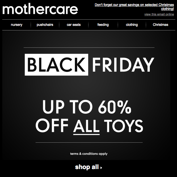
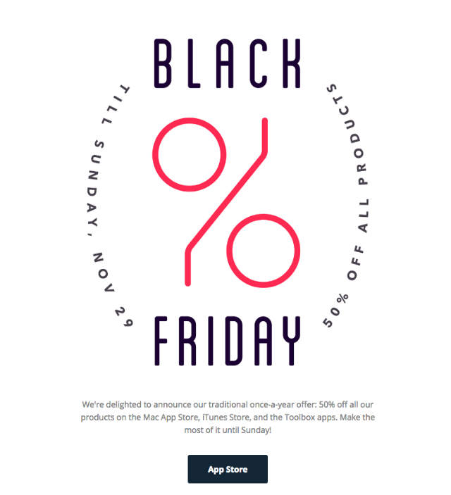
Just like Mothercare, Jumsoft’s campaign uses minimalism and clarity.
Advise
I have piece of advice for you. If you want to stand out from the crowd, you should communicate other content besides promotions. How about making a guide on how to prepare for Black Friday?
The New Look decided to prepare just such a guide for their subscribers, putting together five easy and funny steps for making a plan during the Black Friday rush.

Keep up with the kids
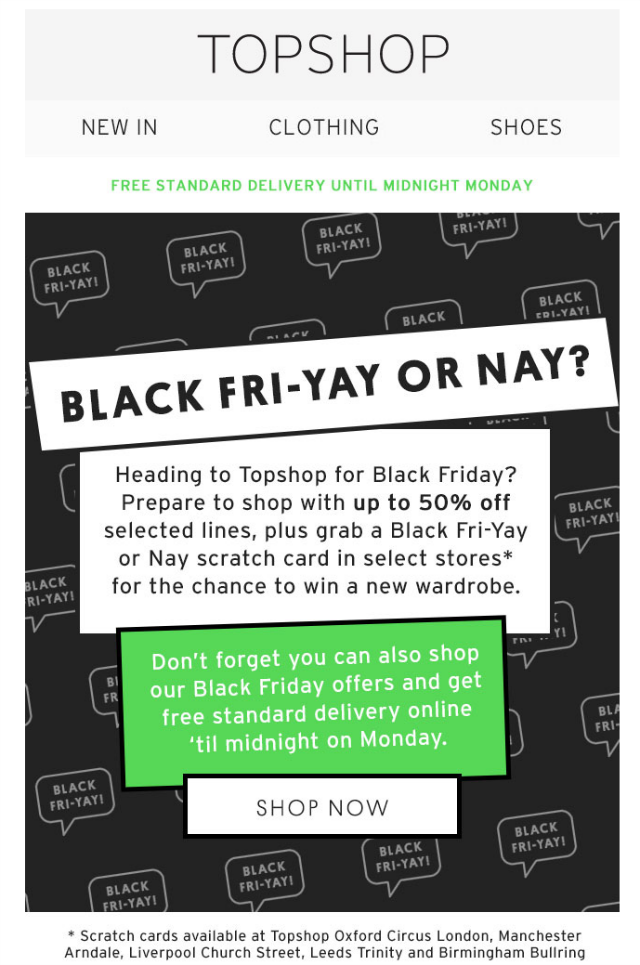
If your customers are mostly young people, there’s a different style that might be more relevant and catchy that you can use in your email campaigns. That’s what TopShop has done. They’ve combined a nice comic style and contrasting colours to make a great impression.
Not only Black (Friday)
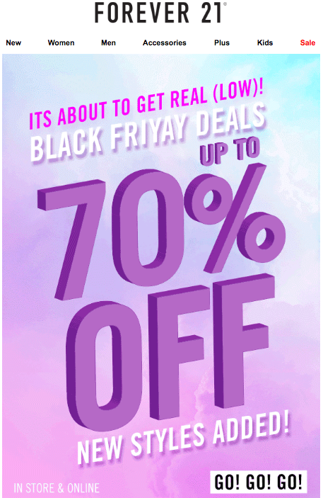
Do you think that maybe black doesn’t always exactly fit with your business or logo? That’s ok - Black Friday doesn’t have to be all-black all the time. Look at this Forever 21 campaign. There are happy pastel colours, pink and blue. It says more “cotton candy” than “Black Friday”. But if that’s wrong, then that’s ok because everything you need to know is clear.
Summary
Black Friday is a great time for taking inspiration and doing a little spying on your competitors to see how they communicate their promotions. If you want to stand out from the crowd you need to listen to your creativity. Maybe your weird idea is just the trick? You’ll never know until you try it out!

