 FreshMail
created
edited
10 Best Practices For Creating Email-Centric Landing Pages
Back to list of articlesDo you think you can run your website without email marketing?
If yes, then think again!
Why?
It’s because a website drives only the front-end sales, while 90% and more sales is achieved through emails and other means.
Why Email Marketing Is Considered Indispensable
- Email users are forecasted to rise to 2.9 billion worldwide by 2019. (Source: Statista, 2016)
- Email has an average ROI of $38 for each $1 spent. (Source: DMA, 2015)
- An email has a median ROI of 122%, which is four times higher than other marketing formats, including social media, direct mail and paid search. (Source: eMarketer, 2016)
- In the U.S. alone, email users are projected to grow to 244.5 million by the end of 2017 and by 2020 it’s expected to grow to 254.7 million. (Source: Statista, 2016)
- Over 1 billion active users are on Gmail as of February 2016. (Source: Techcrunch, 2016)
- The Apple iPhone leads the pack in email client market share with 33%. (Source: Litmus 2016)
- White collar workers have started spending more time checking emails. According to Adobe’s second annual report it almost increased by 17 percent YoY. (Source: Adobe, 2016)
- Email checking while watching TV or while watching a movie has increased by 69%, in bed by 57% and on vacation by 79%. (Source: Adobe, 2016)
- Brands that personalize marketing emails receive 27% higher click rates and 11% higher open rates than those that don’t personalize. (Source: Experian, 2016)
- In 2017 email marketers will look to upskill themselves and become strategists rather than technicians. They will increase their use of personalization. (Source: HolisticEmailMarketing, 2017)
- More than 86% of businesses surveyed indicate that they plan to boost their upcoming email marketing budgets. (Source: Email on Acid, 2016)
According to a marketinglanding post, setting up a dedicated landing page for building an email marketing list accelerate conversion rates almost by 50%.
The biggest plus being, you can apply your conventional landing page conversion techniques to your email marketing landing pages as well.
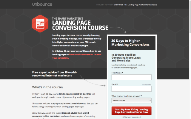
A dedicated email landing page from Unbounce promoting its educational course on constructing better landing pages:
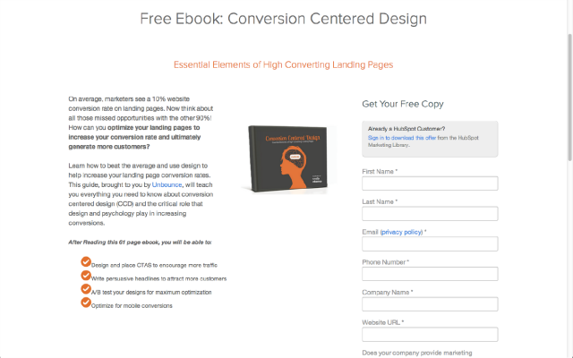
If you are running a B2B software company, you should take a look at HubSpot example. It’s one of the finest email marketing landing pages you’ll find on the web. In fact, there are hundreds of such landing pages on HubSpot attracting leads for a good number of email marketing campaigns.
10 Best Practises For Creating Email-Centric Landing Pages
#1 Use Clear Call-to-action
It’s a killer feature that help generate leads and more. So make sure to come up with crisp CTAs liners, no matter whether you are selling chalk or cheese online.
And yes, use power words like “Click Here,” and “Go” in your CTAs. But, avoid words like “Submit.” It’s a dreaded word according to an Unbounce post, as it could reduce the conversion rates almost by 3%.
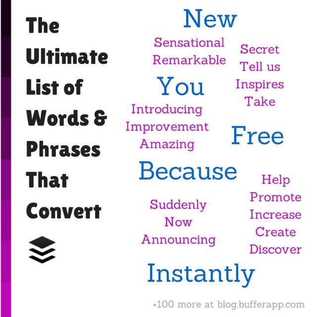
A list of power words from Bufferapp. Try using them in your email copy or landing pages.
For more power words, check out smartblogger power words list. The site has come up with an exhaustive list which could be helpful for all your online marketing communications needs.
#2 Use Single Call-to-Action
Want to sell several things at the same time, such as home page, blog page, product page and more? But the fact is, it doesn’t work. If conversions are what you are looking for, you need get your customer focussed on a single task at a time. So use only single call-to-action if you are serious about conversions.
#3 Use Red Button for Call-to-action
According to a post by ConversionXL, call-to-action liners with red button attracts more conversions than any other color. Hubspot conducted a test on one of their client’s pages using red and green buttons, and as expected, the red button outperformed green by 21%.
However, there’s no hard and fast rule that only red button sells, it’s just a rule of thumb. But then, one thing you should be careful about is that it should have a contrasting color compared to the text color. Other things to consider include, enough white space, rectangular or round shape, complementary border and maximum 60 characters.
#4 Consistency in Message
You got what I mean, right? That is the messages displayed on your landing Page should be in perfect sync with the messages that appear in your email copy. Say, if your landing page says: Buy 2 Shirts + Get 1 free, your email copy should repeat the same discount offer and should read the same, down to the last letter. Remember: Repetition is gold in email marketing.
#5 Consistency in Looks
It goes without saying that landing pages and email should look the same. And this includes everything under the sun – be it font, color and the overall look and feel of the landing pages and the emails. This is a must because when the customers leap from the landing page to the email page they should instantly connect with your message and not make them think, Oh no! Where have I landed, and things like that.
Simply put, your landing page and emails should offer unified experience for users.
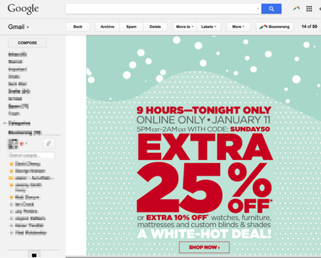
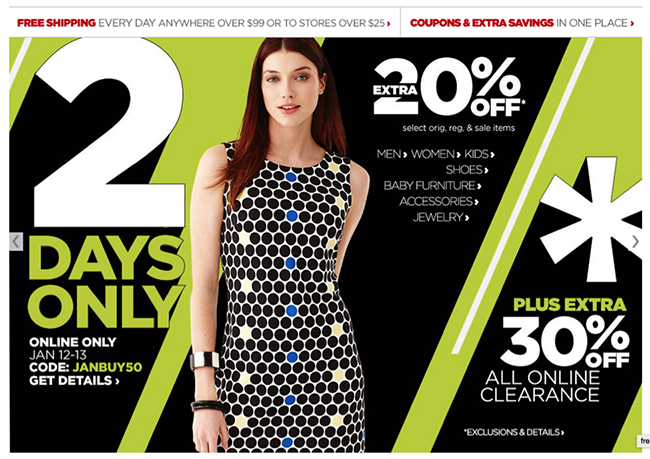
Here’s an example of an eCommerce company that’s got it all wrong in terms of message and looks.
On clicking this email you get to a landing page that seems not at all familiar to you.
And what with so many discounts on display on this landing page, while your email speaks of only one. Highly inconsistent messaging...isn’t it?
#6 Don’t Drag Your Copy
Your copy’s job is to clear customer queries/doubts as to why they should be part of your email list. Nope, you don’t have to elaborate it so much that it bores the visitor. Keep it short.
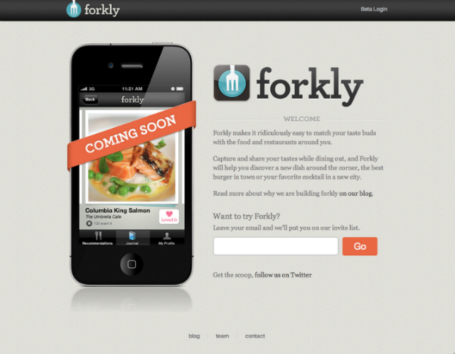
The forkly example clearly states as to why you should subscribe to their email.
# 7. Build Urgency into your Copy
The element of urgency can help accelerate conversions. A ConversionXL post , “How Creating a Sense of Urgency Helped Me Increase Sales By 332%,” explains clearly how by employing crucial twin factors such as scarcity and urgency helped the author of this post accelerate company’s coversions, drastically.
Zero urgency in copy
Urgency embedded through the time element
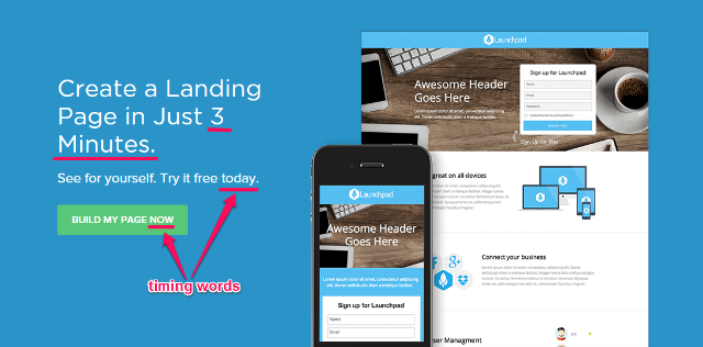
The second copy has factored in the time element combined with “Bundles Bought and “Status” which helped it outperform the previous ad by 3X. Likewise, you need to employ call-to-action words such as today, now, and more to get more clicks. It makes people take action, which is exactly what a call-to-action is supposed to do.
#8 Avoid the Form Format
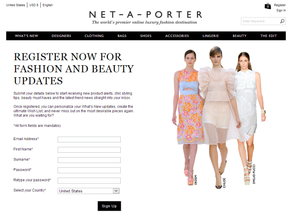
Generally speaking, people hate forms. So avoid them, if you can. But then, if it seems to be an impossible task to you, make sure to include only a few columns. Overloading it with columns is a sure-fire way to put off your audience.
Net-a-Porter’s dedicated email landing page has got only few crucial columns:
#9 Leverage Social Proof
When I saw her kneeling in front of the crucifix, I too kneeled at once. It was a knee-jerk reaction. It just happened. Because I too wanted to ensure that not just my friend, I too was an equal recipient of Jesus’s love and mercy.
The long and short of it is that people hate being left out.
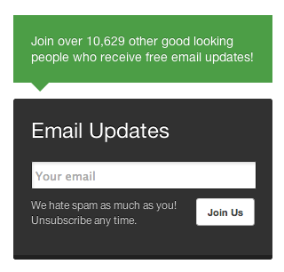
And social proof could be used as an involvement device, telling visitors that if they wish to enjoy the same benefits that’s already available to other subscribers, they too need to be part of the email list.
The most commonly used social proofs are social media “likes” or “subscriber counts.” Buffer leverages social proof for its blogs’ newsletter.
#10 Test your Landing Pages
Not just your email campaigns, even your landing pages should be tested time and time again to maximize your email’s success rate.
And, I tell you, testing is not a big headache. You just need to keep playing with key elements such as image, text, call-to-action to make sure whether or not they resonate well with the audience.
Conclusion
No doubt, several factors come together to make email marketing a success. But then, setting up an email-centric landing pages are equally important if you are looking at lead generations. Take into account the above best practices and you will be good to go.
Now, it’s your turn. Does your company use email-centric landing pages for email campaigns?
If yes, how has been the experience so far? Let us know in the comment box below.
Learn how to integrate FreshMail with landing pages builder. Create landing pages and generate leads.


