 FreshMail
created
edited
Make the right first impression with your message headers
Back to list of articlesImagine a situation where you go to pick up a girl, not yet your girlfriend, in a dilapidated, beat up and generally piece-of-junk car. Despite this, inside it has a strong, newly renovated engine with a Junkers JU 87 swallowing gallons of air. And despite the fact that no one in town wants to challenge you to a race you can see that this date might not go as you wanted - why not?
Because first impressions are most important and you lost it with your back bumper secured in place with reflective tape.

So what does this have to do with an attractive “head” to a newsletter? Well, quite a lot since it’s the first thing a subscriber sees after opening a message from you. Regardless of the content you want to present, if the first impression you make is negative then there’s a big chance that the reader will simply close the message without showing any interest in the rest of it and that’s what we really depend on!
These days, when we’re buried under a huge amount of graphics and texts of every kind, the first 2 or 3 seconds decide if your recipients are interested in what you have to show them - so remember that. In this short article I will show you to make sure that your “date” with your recipients goes as well as possible!
What is a header?
A well-designed newsletter should consist of three parts. From top to bottom, they are -
- the header - this is the part of your newsletter that is visible right after opening the email that it’s in. We will come back to the subject of what you should put in it in a minute
- the body - the main part of the newsletter and location of the most important content that you want to communicate to subscribers
- the footer - this is where you usually find information about the sender, but it can contain other information as well. You will often find links to social media platforms and information regarding legal regulations related to email marketing. Footers are typically fixed, meaning they are the same in every email that is sent.
What goes into the header?
Preview link
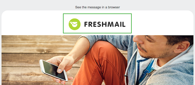
As an email marketer, you know that you should include a preview link in every newsletter you make. Preview links make it possible to view the newsletter in an internet browser in the event that it is not properly displayed by the email service provider.
There are lots of email services, desktop applications and mobile apps that are used to access email. The variety of platforms means that creating a newsletter that properly displays in all of them can be a challenge. Don’t let this discourage you, though, and remember that you can always refer to our CSS Report for help.

Newseltter: FreshMail
Preheader
This is the text that displays in a subscriber’s inbox, right after the subject line of the message. In 2010, Google introduced this small but significant change in Gmail, which opened the door to a whole new world of possibilities for email marketers. Other email services soon followed suit and now preheaders are essentially universal.
Preheaders give you a chance to get subscribers interested in opening your message by giving them more information about what’s in it. By default, the email programs use the first line of text in the message as the preheader but, with a little extra effort, you can create whatever preheader you want. All you have to do is to place the text you want to serve as the preheader at the top of your newsletter design during the creation state. Use the smallest possible size - 1px - and make the text color the same as the background color of the design. This way, the text will be invisible when the message is opened but will still be detected by the email service provider and placed in the inbox as a preheader.
![]()
The importance of preheaders is growing since, in addition to Gmail, preheaders are now used by most mobile and desktop email applications. If you don’t include preheaders, after the subject of the message a link beginning with “If you cannot see this message…” will appear.
Given the fact the google is typically at the forefront of creating new trends that others follow, it’s a safe bet that one day soon preheaders will be essentially universal. You can read more about preheaders here.
Obviously, the biggest influence on your open rate comes from subject you give your campaign but the preheader can drive that number a bit higher. Create it in such a way as to use the recipient’s curiosity in your favor.
Logo
Eyetracking studies have shown that the best place to put your logo in your newsletter is the upper left hand corner, which is not big news since almost everyone does it but not everyone links to the logo to their website.

Newsletter: FreshMail
Typically, after clicking on the graphic we are redirected to the main page of the sender and this is a standard practice you should always follow. One possible exception to this is when you are organizing a specific event, promotion or contest which involves visiting a particular sub-page of your website. In such instances it is better to link the logo directly to that page so that visitors don’t have to spend time looking for it.
Consistent colors, fonts and menus
Apart from the inclusion of your logo, another key element of identifying yourself to subscribers is the use of visual elements that are consistent with your website. This is what helps customers recognize the link between an email they receive and a brand they know.
This applies to colors, fonts, menus - any and all graphic features that help to create your online identity.

Newsletter and landing page: Future Insights
Graphics that get attention
Remember to take advantage of anything that can help to hold the attention of your subscribers. Research shows that -
- our eyes like to focus on faces - especially eyes - and forms
- we are also drawn to logos, especially ones that we recognize
Another interesting aspect of the way that our attention wanders is the fact that people pay more attention to numbers in the form of digits. This doesn’t mean that we encourage you to send newsletters with the gratuitous use of numbering - "Newsletter No. 7", "Newsletter No. 8," etc. - because it’s a waste of valuable space in the preheader section but it’s something to be aware of.
The bottom line
So there you have it. When trying to get the attention of your subscribers, first impressions are absolutely crucial and you only have a couple of seconds to make them. Carefully plan the “head” of your message. Don’t forget about preview links, consistent colors or the proper linking of your logo. Get these things right and all of your campaigns will start out with the best possible chances maximum returns.

