 Renata Gajoch-Bielecka
created
edited
Newsletters on Smartphones – The Good and The Bad
Back to list of articlesSo the share of your sales that comes from m-commerce isn’t very big? You think you don’t sell via mobile devices? Maybe it looks that way since transactions don’t take place on smartphones as often but huge numbers of consumers view newsletters on their smartphones every day as part of the process that ends with them finalizing the sale on a different device.
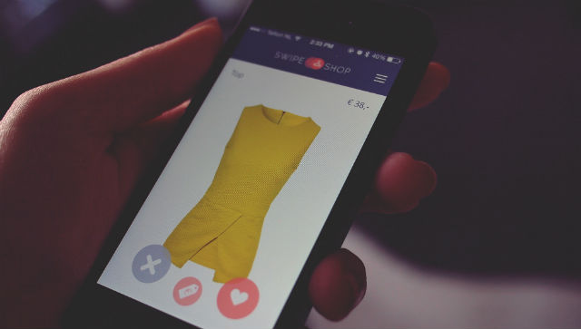
Surveys show that 53% of emails are opened on smartphones. But when is the decision to buy made? If your newsletter and online store are easy to view on smartphones, then you’ve taken a huge step toward persuading subscribers to click the “buy now” button.
Responsive newsletters are no longer optional, they are a must. This is how you can be sure that your message will display properly on devices of all sizes and resolutions but even that’s not enough today. Things like the width of your design and the fonts you use also need to be optimized for mobile technology. Let’s look at a few examples that will help you decide if your newsletter is properly designed for smartphones.
What can you see without scrolling?
The area that is visible upon first arriving on an internet page without having to scroll down is known as being "above the fold". This is space plays a crucial role in the click and conversion rates of any campaign. A poorly designed newsletter that forces recipients to search for key elements like call-to-action buttons will never reach its potential.
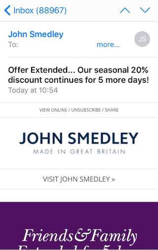
Newsletter: John Smedley
- You can’t see the whole project without scrolling down.
- Part of the text uses a font that is too small and difficult to read.
- The graphic doesn’t show a specific product and you can’t see the CTA until you scroll.
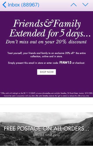
Newsletter: John Smedley
- After scrolling through the page you can see the whole offer although the products are not represented and there’s nothing to draw your attention to something you might want to buy.
- The primary message from this newsletter is about free shipping.
The design doesn’t display well on a smartphone screen and fails to encourage you to click through to the store’s landing page. Also, the buttons are too small.
Buttons matter
Buttons in your newsletter should be long, wide and at least 44px. Why? Users need to be able to click on them on smartphones without having to increase their size. You should also use colors to help them stand out. Use contrasting design elements to draw attention.
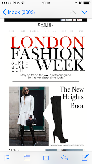
Newsletter: Daniel Footwear
- The top part of the newsletter looks great. The title is clear and the product is well represented - inspired styling and professionally photographed.
- The visuals and the text are clear, laid out well and in proportion.
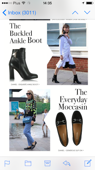
Newsletter: Daniel Footwear
Scrolling down, we see the first problem. First of all, we don’t see any buttons. What are we supposed to click on? It turns out that the entire newsletter is hyperlinked and clicking on a particular product will take us to a landing page dedicated to it.
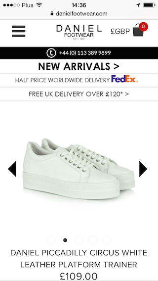
Newsletter: Daniel Footwear
Another problem is the number of items in the newsletter. Too much scrolling tends to discourage subscribers, especially when there is no specific call to action.
To sum up, the newsletter generally looks good on smartphone screens to the way it’s linked could be better. Overall, it’s well optimized for mobile devices. The page works well on mobile devices and the products are clearly visible.
Know what it’s about as soon as you open it
There’s a trend in email marketing that says it’s best to make straightforward newsletters with one primary message that can be entirely seen without scrolling. A simple message with a clear CTA is the best way to encourage subscribers to click and be taken to your landing page.
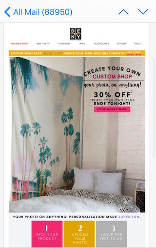
Newsletter: Deny Designs
- The main part of the design is composed of one graphic and that’s why the size of the font was not automatically adjusted to the resolution of the screen.
- Most of the text on the buttons can’t be read without enlarging it.
- The call to action is not very visible and gets lost among other information.
There is no responsiveness here and the whole design was simply shrunk to make the height and width fit. Don’t see the difference? Look at the next example.
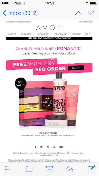
Newsletter: Avon
Here’s a newsletter that looks great on mobile devices.
- You can see everything without having to scroll down and there is one simple, direct offer.
- The CTA button is plainly visible in the top part of the design.
- The products look great and the central message of the newsletter is highlighted.
Everything is designed to properly display in smartphones. Well done!
Do you want your newsletter to look great on smartphones? Always preview your designs by sending a test campaign and open it on your own phone. Remember that FreshMail Designer can also show you what your campaign will look like on mobile devices before it’s sent. Good luck!

