 FreshMail
created
edited
What No One Tells You About Conversion-Centric Email Design
Back to list of articlesMore than your open rate and click rate, your conversion rate is the real factor that boils down the success and relevancy of your email marketing campaign.
We all have nailed this belief rightfully in our minds that lead nurturing via emails helps us in moving our leads to the next level in the conversion funnel. This involves targeted messages that empower our subscribers with relevant information to help their decision-making process. However, the time, resources, money, and efforts that you invest in building email marketing campaigns, may leave you questioning the ROI.
How Your Customers Are Behaving Online?
Overwhelmed with volumes of information on the web, including the inbox, people often use shortcuts to decide. Many times, they rely on how they feel and let their emotions take the driver’s seat as it is not possible to sit and mentally make out the logic behind every single piece of message that comes their way.
I bet you go with your emotional instinct when you see your inbox dumped with mails from almost all kinds of industries. You will only engage with those that you find interesting. When consumers feel that their values are in sync with your perception of client’s values – conversions from your emails will shoot up. This is where emotional call-out comes. So, what triggers engagement and actions? What repels them and what could entice them?
The Role Of Design In Email Marketing
At this very moment when your subscribers are scanning through the emails in their inbox, you have just one click to prove that the email is worthy because the chances of majority of emails getting opened is just once. This makes it evident that your emails shouldn’t only be relevant in terms of message, but should also strike a visual chord with your subscribers. This visual relation considers a range of factors including your goals, demographics of the subscriber, their lifecycle stage and previous online behavior with your communications. Your subscribers have opted-in to receive valuable information and offers. This is your golden ticket to maximize conversions by guiding them and empowering them to take new steps towards your business, by packaging your emails with the “WOW” factor at every step.
In this article we will see how you could create this visual connect with your subscribers to get the maximum engagement that translates into conversions.
1. Grid Planning For Optimal User Experience
This is the phrase where designers and marketers should work together. The experience of both the teams will ensure:
- Which elements are vital?
- Where should these elements be placed?
- How they should be placed?
While determining the grids for your email template, you will have to take into consideration the following factors:
- What is the goal of this email message?
- Which element in this email will help in achieving this goal?
- Which are the KPIs (key performance indicators) for the achievement of the goal?
- Which elements would you like to see in your email? The most common elements are:
- Header
- Navigation bar
- Content
- Paragraphs
- Images
- Footer
- Calls-to-action
- Create a mock-up of the email template and decide which elements should appear according to the chronological order of their importance. This will develop a visual hierarchy for your message and help you deciding the places that will attract attention at key messages and other elements:
- Which elements will be inserted at the top, middle, or bottom?
- What is the order of the importance of each element that you have decided?
- Should the content and any action blocks be differentiated?
- Which elements could be compromised with?
At HubMonks we use the HubSpot COS web development platform that provides a drag-and-drop interface. It is based on a 12-column grid layout and every element is placed inside this grid. It becomes convenient for our developers to preview each time the add or arrange the modules.
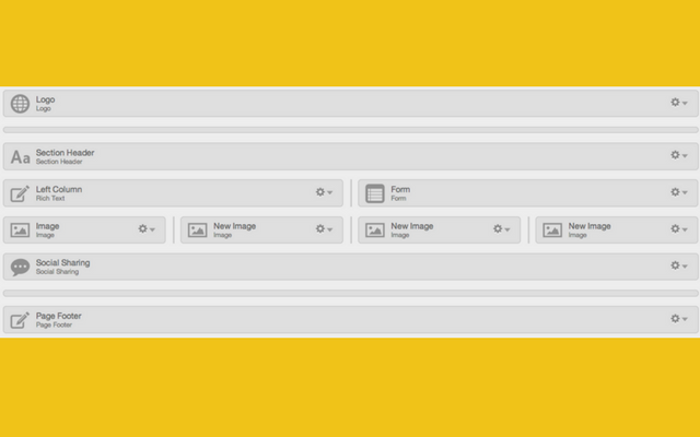
An image of the HubSpot COS web development interface
- Mobile Grid: A massive chunk of emails are read on mobile phones. Thus, it becomes inevitable for you to keep this segment of audience in mind for grid design. You could use the same blocks that you used for bigger devices, however there are certain requirements for optimal visibility on mobile phones:
- For smartphones, plan for the grids that should be replaced or resized.
- Create media types to define the CSS based on the screen size.
- Create if-then logic for the styles in your email. Here are the most important elements. For instance, convert 2 columns into a single column, fonts or colours.
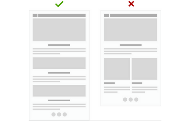
Source: Red Door Interactive
2. Include Attractive Imagery, Graphics, And Colours
Images have a strange connection with user behaviour. When used smartly, they tend to increase engagement and shoot up the conversion dramatically. However, images and graphics should successfully strike the right balance between your brand, the message, and the demographics of your targeted subscribers.
- When you stick with your brand voice and elements, it increases familiarity and trust levels. This results into instant increase in engagement and click-through rates.
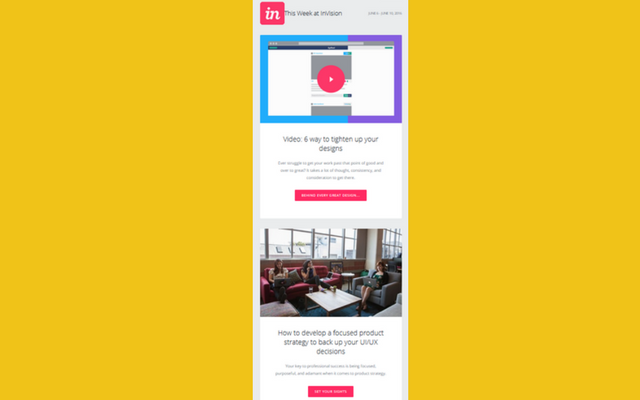
Invision App shown above has done a great job to maintain their brand elements throughout their email communications and website. They have the same logo, CTA colours and font used across all their communications which makes it easy for the audience to relate with the brand when they click-through and reach the website.
- If you want to grab more eyeballs towards a message, you should try considering bright colored images that demand immediate attention. Similarly, a themed email like those of wedding arrangement should have elegance with the imagery creates the same luxurious and serene ambience as wedding.
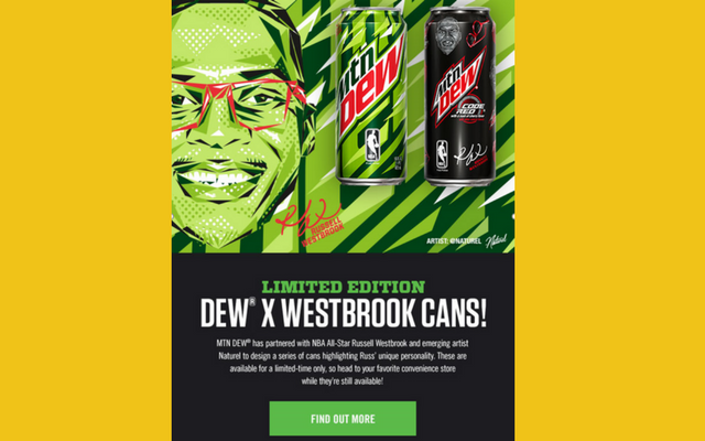
Mountain Dew, a brand that attracts youth, has used the right mix of its brand colours to boost engagement
- While deciding the kind of images and colours that you should use in your emails, it is highly recommended to consider the demographics of your targeted audience. For eg: those looking for adventure related news and updates would want to see bright and catchy colours.
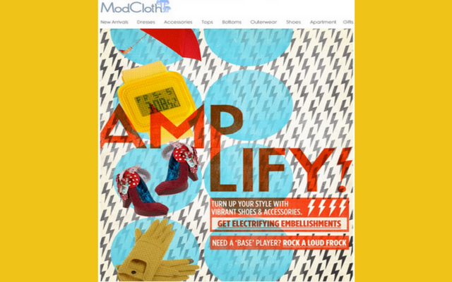
This newsletter from Mod Cloth has set up the right tone to promote vibrant shoes and accessories with the right combination of colours and images.
3. Readable Content Across Multiple Devices
Readability is the factor that draws a thin line between emails that hold the recipients’ interest and the one that repels them. You may have a great offer, but it will go in vain if the user doesn’t even care to read it. So, it all starts with the readability of your emails. When considering the characteristics of readable emails, the following three points are unavoidable:
- Accuracy: Is the message successfully conveyed?
- Brevity: Is the text given in the most understandable language?
- Clarity: Is it clear to the subscribers what the message is all about and what actions are required from their end?
According to Marketing Sherpa, readers are spending 15-20 seconds on every email that they open.
These 15-20 seconds are not spent on reading. Instead, users scan your emails during those 15-20 seconds.
Readability on mobile devices is one more unavoidable factor. According to an “Email Client Market Share Trends” report by Litmus for 2017. Unlike the desktop user behaviour that is popularly associated with the F-patters and Z-pattern, mobile users don’t get the freedom for this horizontal and vertical scanning. Here are some tips that will help you optimize your messages for mobile users.
- If you are writing customized messages for mobile devices, shorter content is not the only tactic. What you write should be better for the audience to consume every line that they scroll.
- Most of the mobile users attention is fixed on and center and the upper two-thirds of the screen. So, try to insert your most important messages on the center and the high end of your message.
- Rather than stuffing images, use only the images that reinforces your point.
- Clarify the WIIFM (What’s in it for me) factor for the users with strong headlines.
- Put your important CTAs affixed at the bottom, so that they are visible while the users scroll down the content on mobile.
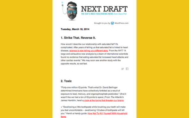
Source: Customer.io. This email provides ample space between two paragraphs for easy consumption. Moreover, the social sharing buttons make it easy to differentiate between two paragraphs. The hyperlinks are aptly highlighted to make them stand out from the rest of the elements on the page.
4. Use Calls-to-Action That Stand Out
How wonderful it would be if you had only two elements in your email marketing campaign? Subject and Call-to-Action. It would be great for your conversions, right?
Alas, the recipients demand relevant information before taking any step further. But once they are convinced, your CTA is the one-man-army that will decide the future of your conversion rate. The CTA takes your subscribers to the next level of the lifecycle journey and that means a lot to your bottom line. Here are some tips for high-converting CTA for your emails:
- Make it short: Filter down the essential elements of your call-to-action and restrict the copy to 4 words maximum. Anything more than this will be too long. Your call-to-action is the shortest element with the biggest impact. Keep it that way.
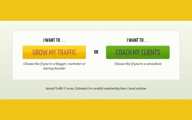
Source: Wordstream. Rather than inserting “I Want To” inside the CTA, the guys at Quick Sprout decided to keep it outside to limit the words inside the CTA.
- Clearly convey with actionable words: The call-to-action is the director for email recipients. This is the word that indirectly speaks “ACTION” for you. If you would come across a client who doesn’t even have a second’s time for you and you only have one phrase to say, what would you say? Clearly tell people what to do with proper instructions. Or simply let them know without beating around the bush what lies ahead when they click-through.
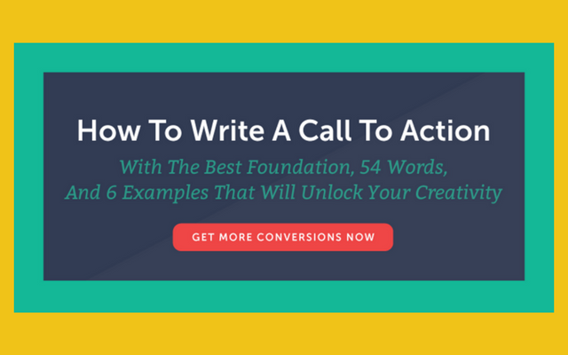
This CTA from coschedule.com has all the right elements of an actionable CTA that builds a sense of urgency.
- Use Bright Colours: When you consider attracting eyeballs, the button colour matters. You have to strike a balance between being the center of attraction and not seeming to be disturbing. The safest thing you could do is have a call-to-action in contrasting colour. A/B testing is the best bet.
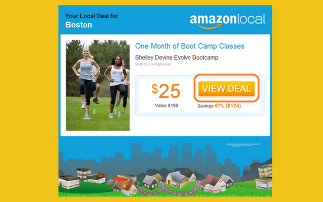
Source: Pinpointe. The bright orange colour differentiates the CTA from the rest of the elements of this email from Amazon.
- Add white space: A handful of whitespace around your call-to-action will help you in differentiating it with the rest of the elements on the email template. It will serve as a visual break that will catch the recipient’s attention. For mobile users, it provides a clear area for your users to identify clickable button and place their fingers comfortably.
- Keep it visible: Above the fold CTAs and affixed CTAs at the bottom are the best bet to get maximum conversions.
- Check out the hierarchy of calls-to-action: Chances are that you might be having multiple CTAs and links throughout the copy. However, don’t divert attention from the #1 CTA. For all other CTAs you could use a grey-scale or matching colors. The main call-to-action should also be the biggest from the rest and the brightest.
5. Interactive eMails
Are business websites more interesting than emails? They are with moving elements and clickable content. Websites let the users take certain actions to make them a part of the communication. With major email clients now supporting interactive elements built with the power of CSS, interactive emails have now become the biggest property for email marketing.
In simple terms, interactive emails contain an element that subscribers would like to engage and interact with. It means that an event takes place to change an element by simply clicking or typing something.
There are 2 factors that hugely support interactive mails:
- More and more email companies have begun supporting the coding standards that allow interactive email interactive elements.
- Interactive emails could boost engagement, click-through-rates and the virality of your emails when recipients are tempted to share it within their network.
Here are some examples of interactive elements within emails:
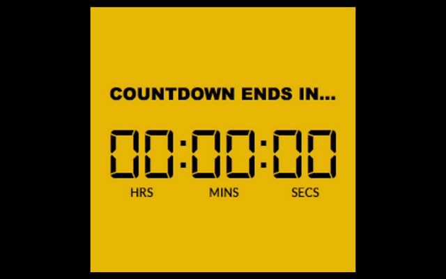
- Counters: These elements create a sense of urgency amongst the readers. These are the best elements for eCommerce stores that are giving out a discount for a short duration to their subscribers.
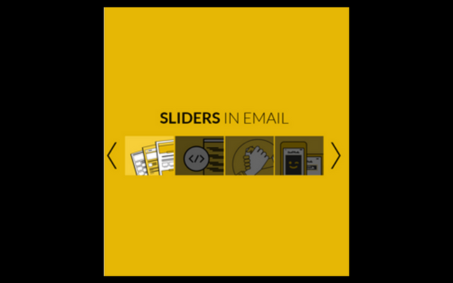
- Sliders: These elements works the best when you have multiple products, clients, or certifications to display within emails.
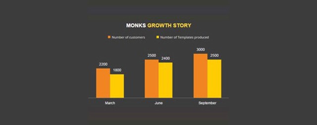
- Graphs: Interactive graphs could speak a lot about your achievements or some industry update that you would like to share. This visual representation of data is available on almost all the platforms.
At HubMonks, we have created a resource that discusses the most popular interactive elements along with their applications. Readers are also able to get a sample of this element in their inbox to get an idea about how interactive elements could make your email a micro-website.
Wrap-Up
The use of creative email designs could dramatically shoot up your conversion rates for the clients. With emails you have great chances to meet the expectations of your subscribers, as they subscribed with some vision in the first place. When they like what they see and read, they would like to learn more.
Email design is a complete package that encapsulates your message and various other elements to make it a wholesome experience for your recipients.

