How to design an email – rules for creating content and graphics
Back to list of articlesAre you ready to start using email marketing but you’re not sure what kind of content works best in email campaigns? Or you’re already sending mails but you want to know more about what kinds of graphics get the best response? We’re going to take a look at some basic rules for creating content and graphics and the answers to some common questions on this topic.
You’ll get to know:
- Why the way your message looks has meaning for how subscribers react and how they perceive your brand
- General rules for creating message templates, standard email layouts and how to make them more effective
- How to write content for email campaigns
- How to create graphics to get the results you want
Why are the appearance and content of your mail so important?
If you’re wondering if it’s worth investing time and resources in the appearance and content of your emails, think about it from the perspective of your recipients. The aesthetic appearance and attention to details speaks to your status as a professional. A readable and eye-catching message increases the conversion rate of your emails, especially if you have a clear Call To Action. It’s about creating an overall impression that communicates trust and confidence.
How to design an email - basic technical requirements of email campaigns
A professional approach to mail design is required to ensure that they display properly to your recipients.
Start with some technical aspects like making sure that your message doesn’t exceed the recommended width of 600px. This should ensure that your message will display well on screens of different resolutions. As for the length, it’s up to you but remember that the overall size of your message shouldn’t be more than 400KB.
If you want to add graphics to your message, make sure they are in .jpg, .png or .gif format. It’s also important that you don’t add graphics that are too large, it’s better to divide them into smaller individual files. This is a good habit to get into since not only because these smaller graphics will more easily pass through spam filters but also because they won’t be compressed and sacrifice image quality.
In addition, more and more of us check our emails on smartphones. To make sure that your message displays properly, it needs to be responsive - able to automatically adapt to screens of different sizes.
Any templates you create in FreshMail Designer will always be responsive!
Remember to use a single or, at most, a double-column layout for your message template. This helps to ensure that the message will be logically organized even if the parts are reorganised to fit screens of different sizes.
The next important part of building a good message template is using ALTs, text that appears in place of graphics if they don’t appear automatically in an inbox. Make sure they describe the graphic that’s missing and encourage recipients to download them.
General rules for creating email messages
Moving beyond these basic technical aspects of creating a message template, let’s turn to how content is arranged and good practices that help to make your campaigns more effective.
A well-designed message is comprised of several important elements. We can divide them into those parts that recipients see before and after opening it.
Sender name
The first of these are the sender name and message subject. If you want your message to get opened, the recipient needs to trust the sender. You need to decide if you want to send messages as a company ( for example, “FreshMail”), as a person (let’s say, “Eliza”) or a combination of the two (“Eliza from FreshMail”).

Message subject
The second matter is the message subject. Bear in mind that 33% of recipients will open a message because the subject convinced them to. Try to make your subject line say a lot with a minimum of characters. Research shows that two-word subjects work best. If you can’t “do it” in just two words, put the most important part of your message at the beginning of the subject line. That way, the most important elements will stay even if the email service provider cuts part of the subject line off.
Preheader
Preheaders can be used as an extension of the subject line. They are made up of the first part of the message body but the length depends on the email service provider.
If you want to get even better results, use personalisation in the subject line and address recipients by name. You can boost your open rate up to 126%!
Layout
Your message template should contain three main elements: headers, main content and footer. The header should contain your logo (best in the upper left corner), a preview link and a preheader.
Whatever form your mail takes (autoresponder, newsletter, etc.) the main content should get across all the points you want to communicate in your message. The choice between a graphic or text-based message is up to you. It’s important to keep the same layout over time and not change with each campaign. Focus on your message and encourage recipients to get details through the use of CTAs.
Use your footer for information about how to unsubscribe from your newsletter along with your contact information. If you’re also active on social media or you have some other announcement like a frequent customer program, the footer is a good place to promote them.
Remember to create one primary template and then change the content between the header and footer. This makes your communications consistent and recognisable.
Visibility
There’s one more thing that can have an influence on the conversion rate of your messages - the area “above the fold”. This is the part of the screen that is immediately visible without having to scroll down. Make sure you put the most important elements here along with your CTA to make it as easy as possible for recipients to complete the desired action.
See also:
Writing content for your emails
We all know that “content is king”. Recipients expect your content to be of a high standard and useful to them. It also needs to be in a form that fits with the behaviour of today’s subscribers.
Scanning, not reading
Everyone has learned to deal with the overwhelming amount of information we get every day by quickly scanning it instead of reading. We look for the most important information, hopefully highlighted with bullet points or some kind of formatting. You have just a few seconds to get your message across and persuade recipients to click on a link so you have cut the fat out of your content!
When writing your message text, remember to:
- Use short sentences
- Let headers do the talking for you
- Use small paragraphs
- Put bullet points to work
- Put important information in bold
- Choose graphics that complement your content
Most important things first
When creating your message content, remember to add the conclusions first, and then - reasons. It makes your recipients, who is curious about the argument, be more willing to read the whole text and click the CTA button. While creating paragraphs or next parts of news, make them intriguing, but at the same time specific and concise.
The language of benefits
It’s also important that you frame everything in terms of how it benefits the recipient of the message. You have a limited amount of their time and attention to make your case and get them to click on the CTA.
Effective CTAs
So how do you get someone to click on a button? Your message not only has to be short and direct, but it also has to stand out from the rest of the content. Be sure that your CTA is above the fold and immediately visible. Use graphic accents or underline the text to make it obvious that the CTA is clickable.
Look at your message from the perspective of your recipients. Don’t think about it in terms what you want to communicate, but in terms of what your recipients would like to receive.
The right fonts
Remember that your choice of fonts matters. They should be clear, readable and consistent throughout your message. Stick with “safe” fonts that are commonly used to ensure that they display properly on most devices. Good examples are Arial, Helvetica, Tahoma, Times New Roman and Georgia.
See the difference between complicated font and the simple one.
Creating graphics for your message
The other important part of your mail is the graphics you choose for it. Graphics are an important complement to your text since our brains process them 60 thousand times faster than the words we read. Graphics can get your point across quickly and clearly and can get better results than the best-written copy.
A well-chosen picture can effectively persuade customers to buy better than the best text copy and it stays with them for longer. But what if you don’t have a huge budget or a staff of graphic artists and you want to use the best possible visuals for your marketing campaigns? Find out more about making great graphics with free online tools.
Follow these tips for making attractive, attention-getting graphics for your emails.
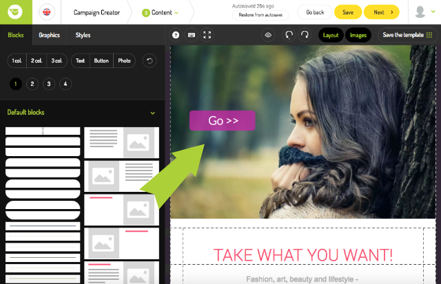
1. Again, most important things first
The same thing I said about text applies to graphics as well - the most important things should appear above the fold. Put your main and most important graphics right at the beginning of your message.
2. Clear CTAs
Make sure your CTAs stand out from the background. This helps to make it clear what you want recipients to do.
3. High-quality graphics
Professional-grade graphics are a must. Also, make sure they come from legal sources and don’t contain watermarks. If the graphic file is large and you don’t want to lose quality by reducing its size, use a graphic compressor like Compressor.io.
4. Consistency
Your graphics need to be visually consistent with the overall look of your design. Make sure that even things like your colour schemes match the substance of your message, particularly if it is commercial in nature.
5. Colours matter
Speaking of colours, choosing the rights one can be part art and part science. Follow the rules and use subdued or pastel shades rather than bold neon colors. Pay attention to temperature and saturation. When selecting colours, follow the rules or combining them:
- by temperature
- complementary
- analogous
- colour triad
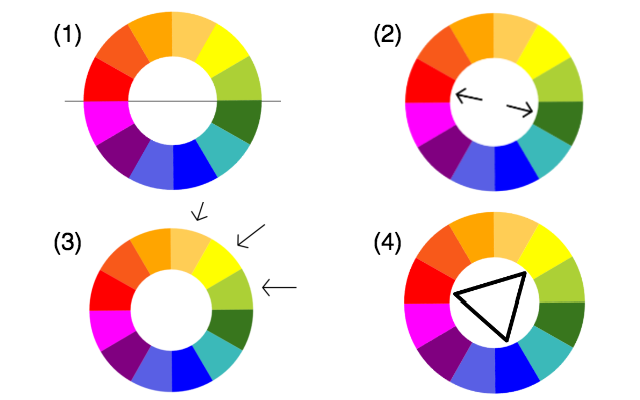
Learn more about the importance and role of colours in our blog post dedicated to the subject here.
6. Not too colourful...
With rare exceptions, three colours should be enough for you. This should give you the variety you need without being distracting.
The same applies to your choice of graphics - don’t get carried away with too many visual elements. This helps to keep the reader’s attention focused and maintain an organised presentation. Simple is always better. Remember that more complex designs can get “broken” when reorganised for display on mobile devices.
7. The right background
Backgrounds should stay the background and not be a prominent element of your design. Stick with simple backgrounds of shades of grey or white.
8. Point to your CTA
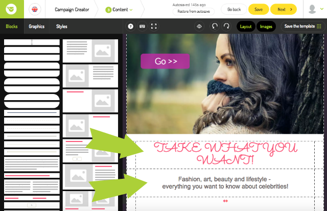
If you use faces or human figures in your graphics, try a trick that often works well. Arrange for the faces to look at your CTA or their hands to point to it. Recipients will catch on and follow with their eyes right to your CTA.
See also:
9. Use GIFs and video
If you want to draw attention to something, it’s hard to find something that works better than GIFs. We can’t help but look at moving pictures and that means a chance to communicate your message. You can easily add GIFs to your message template using CKEditor.
See also: