 Eliza Gniadek
created
edited
Create newsletter template with HTML
Back to list of articlesA well-coded newsletter template with HTML is the key to success for any email marketing campaign. It has to display properly on computer monitors as well as mobile devices like smartphones and tablets.
We’re going to look at the basic rules of creating newsletter templates using HTML.
Designing a newsletter with HTML is quite different than building an internet page. A basic of creating every template is the use of tables, which are the foundation of newsletter construction.
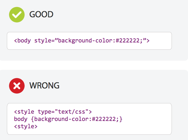
The second big difference is the placement of inline styles placed directly in HTML tags with the use of CSS and not, for example, in brackets like <div>. The main reason behind this is that Gmail does not read styles contained in the header and messages can display incorrectly as a result. See the difference in the use of inline styles:
The basics of newsletter creation
Before you start building a newsletter, it’s best to first prepare a rough draft of what you have in mind. You can even draw out your newsletter by hand on paper if that helps. This lets you sketch out the overall layout and make any needed corrections.
Next, while preparing the message code, remember that your template contains four basic elements:
- Wrapper - a surrounding table that is responsible for the correct width and positioning of the newsletter
- Header - the top part of the newsletter
- Body - the main message content
- Footer - bottom section containing contact information and resignation link
In addition, make sure your template also contains:
- Message subject
- preheader
The standard width of a newsletter is 600px, which allows for proper display on a variety of screen sizes. As for the standard length, generally this is none although it’s important to keep the size of the entire design under 400KB.
To be sure that letters, characters and other symbols display as they should in all languages, use UTF-8 to code your newsletters. It is the only recommended and most popular system for coding symbols.
Text
Message text is obviously an important elements of any newsletter. You have be sure that it’s legible and easy to read.
That’s why you should use fonts that display properly on all types of devices when coding your newsletter. Use so-called “safe” fonts like Arial, Helvetica, Tahoma, Verdana, Times New Roman or Georgia. Also, define if the font should be serif or sans serif:
font-family: Arial, Helvetica, sans-serif;Content style (font family, colour, size) define as the nearest to the text in the element in the table:
<td style="color: #ff2222; font-family: Arial,
       Helvetica, sans-serif; font-size: 16px;
text-align: center; width: 200px;" width=”200”></td>
Save the color of the text in RGB or HEX and the font size in px. The align text, use the text-align properties: left, center and right.
Find more on the subject of fonts in email marketing in our blog post.
Graphics
When you want to add images to a message, you can choose between several formats - .gif, .jpg or .png. These formats preserve image quality while maintaining an appropriate file size. And speaking of file size, keep them limited to 320KB.
Avoid using one, large graphic because this often gets unwanted attention from spam filters.
Fortunately, there’s a way to get around this problem. All you need to do is cut your graphic into smaller elements, which also minimises the risk associated with improper display of graphics. Learn more about this in our post about how to slice images and graphics in your newsletter.
Human vision automatically focuses on what moves. That’s why using gifs is often an effective tool in newsletters, because they draw attention immediately and hold it long enough for you to get your message across.
When using gifs, be sure that the file size is not too large because it causes everything to load more slowly (the optimum size is between 50 and 200KB). Use between two and six animation frames.
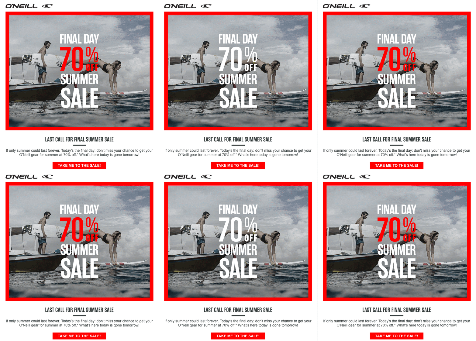
Some email service providers do not support gifs. That’s why you should make sure that the first and last frames are always the same in order to be sure that everyone gets the most important information in your message.
Alts
So what happens if a graphic doesn’t display properly in a subscriber’s inbox? What can you do to avoid this:
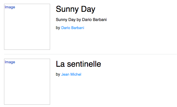
There’s nothing here to indicate what’s missing. That’s what alts are for, to provide a description of the graphic or anything you want to include instead. Alts are visible even if the image isn’t.
Using alts also increases the amount of text in a message, which is important for spam filters since a message that is out of balance in terms of the relationships between text and graphics can be flagged as spam even if it isn’t. Just remember to not make the alts too long because they can fail to display or be moved to another line.
Here’s an example of how to place an alt in an image code:
<img src=”graphic.jpg” height=”100” width=”320”
alt=”Description of image here” style=”border:none;
display:block; color:#22222; font-size:14px;”>
Links
The purpose of a newsletter is often to redirect subscribers to a place outside the content of the message. Links are the mechanism for taking your audience to where you want them to be so it’s essential that you verify that they are working properly and direct subscribers to the right place.
You also need to include two other necessary links. One is the link that allows subscribers to resign from your mailing list - an absolute requirement - and other lets recipients view your message in a browser window in cases where the newsletter contents are not displayed properly.
For the resignation link, use code like this, with an example text:
<resignlink>Unsubscribe</resignlink>Use this to add a link allowing subscribers to view your message in a browser:
<preview>View message in a browser</preview>CTA
Calls to Action are especially important in newsletters since the whole idea is to drive traffic to your site. Most often, CTAs are in the form of a graphic button or link that takes subscribers to an external page or to a form to fill in.
CTAs have to be clear and relevant to your message content. The focus of everything you put into your newsletter is about getting subscribers to click your CTA so it demands extra consideration from a design point of view. Graphic buttons are the best way to since they can increase clicks by up to 45%.
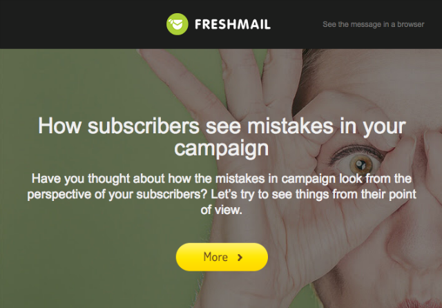
Graphic buttons can be make in two ways: by embedding a graphic or creating them with CSS code, which allows you to define its appearance. You have to be aware that different email service providers can display the buttons in slightly different ways.
Remember that your button should be at least 44x44 px or 44x29 px to make it easy to click on, especially in smartphones. To learn more about CTA, take a look at our post on the best-converting CTAs in email campaigns with some great examples on how to use them.
Responsive newsletters
More and more subscribers are opening their mail on mobile devices and so making sure your design is responsive is key to reaching them.
The characteristic feature of responsive newsletter templates is the use of one or two columns, for which the table should use the align attribute. Use media queries as well and focus on the width of the template so that it automatically adapts to the resolution of the screen.
You’ll find more about responsive mails here:
Summary
Coding your own mails is not so hard. A few simple rules about the construction of templates and how to code & how not to will help you to make a great, well-converting newsletter.
Download our Guidelines for newsletter designers for 2015: Coding and support for CSS technology in various email services.

