The role of colours in newsletters
Back to list of articlesThe shades and hues used in your newsletter have an influence on how it is received by your subscribers. The right colours can encourage a quick decision and help to create a positive brand image.

Certain colours work better than others in particular contexts. When was the last time you saw a Christmas-themed advertisement in pink and orange?
You won’t be surprised to learn that a majority of consumers report that colour is the most important factor that influences their selection of everyday items. This is why you have to be careful to choose colours for your newsletters that match your message.
Debates about the meaning of colour are nearly as old as time but the scientific approach to colour theory started in the 18th century with Newton’s discovery of the light prism. The effect of colour on human emotions was examined by Goethe in 1810 in “The Science of Colour”. The colour wheel we’re familiar with today appeared in 1708 and is attributed to Claude Boutet.
The Psychology of Colours
Every colour has its own ascribed emotions but they often vary in different regions. For example, white is associated with cleanliness and innocence in the West but with bad luck in Asia.
This is one reason why you always need to consider what kind of emotions you are trying to illicit among your subscribers. Do you want to use exciting reds, cheerful yellows or relaxing blues? Sometimes you also need to consider who your audience is since men and women often have different preferences when it comes to colours. If you send a newsletter to women you might use softer pastels instead of stronger colours as you might with men.
Just about every famous brand that you can think of uses colours to influence emotions. Among the top 100 brands in the world, 33% of them use blue in their logos, with red at 29%, black or greyscale at 28% and yellow with 13%. Take a look at which emotions certain colours stimulate and how brands use them.

Source: http://bit.ly/29qHZ7w
Red is a very strong and intensive colour. It’s associated with strength, energy and love but also with danger. It’s good at attractive attention and that’s why it’s used to communicate important messages about quick decisions, like telling us to “stop”. It’s also commonly used in sales.
Companies like Coca-Cola, Red Bull, McDonald’s and H&M use red for these reasons.
Use red in your campaigns to:
- attract attention of subscribers
- motivate them to take action
- inform them about sales or special promotions
Yellow is all about happiness, energy, the sun and optimism. It’s often used to get attention, especially in show windows. Yellow just feels nice and that’s why we see it things like vacation brochures.
IKEA, Shell, Nikon and others all agree that yellow works well.
Use yellow in your campaigns to:
- promote holidays
- draw attention
- highlight products for children
Orange manages to connect two properties we’ve already mentioned by combining the energy of red and the happiness of yellow and that’s why it’s often associated with fun and youth. Orange also has an influence on appetite, making it a common choice among food and drink brands.
Just ask Fanta, Orange and Amazon what they think about orange.
Use orange in your campaigns to:
- promote food items
- spark positive energy, fun, warmth and joy
Green obviously makes us think about nature, ecology, health, safety and calm. Depending on the shade you can accent other properties like light green for freshness and dark green for ambition. Green is frequently used to promote natural products and by companies that want to communicate trust as well as campaign that benefit the environment.
Among others, green is used by BP, Android, Animal Planet and Starbucks.
Use green for:
- ecological products
- medicines
- fruit and vegetables
Blue conveys trust, knowledge, competence and cleanliness. It is also strongly associated with water, air and the sky. This is why blue is often used by airlines, tech firms and cleaning supplies.
Companies like Facebook, Twitter, LinkedIn, Skype, Ford, OralB or Nokia use blue in their logos.
Use blue for:
- enhancing trust in your brand
- promoting cleaning supplies and medicines
- products associated with water and air
Black is a strong but classic and elegant colour we often connect with luxury, power and professionalism.
Sony and Honda use black effectively in their logos.
Use black for:
- enhancing the exclusive nature of your brand
- promoting elegant fashion products
Brown is connected with nature and honesty but also with chocolates and warmth. It’s often used to promote natural products because of its association with earth and trees but also with restaurants, cafes and food items. Together with gold it conveys exclusivity.
Among others, you’ll find brown used by M&M’s, UPS and Louis Vuitton.
Use brown to:
- underline the natural character of a product
- promote cafes and restaurants
- add a warm and comfy touch
Pink is all about girls. Depending on the shade, it can be connected with confidence and enthusiasm or hugs and kisses. We see it often in copy for products for children, cosmetics, salons and spas as well as sweets.
Pink works well for T-Mobile, Yahoo, Barbie
Use pink for:
- Newsletters for women
- Promoting sweets and candies
- Health-related services like salons and spas
Rules for choosing colours
To ensure that you get the optimal effect from your newsletter design, you should know a few of the basics about the selection and use of colours.
Colour temperature
Colours can be divided into warm and cold. Warm colours include red, orange yellow and green while violet, blue, the colours of the ocean and dark green are thought of as cold. A familiarity with how they interact with each can help in creating just the right feel in your newsletter.

Complementary colours
This is basic way to pair colours in any design. It’s all about choosing two colours at opposite positions on this wheel.

Analogous
Another way to combine colours is to group them together according to how close they are together on the colour wheel. Colours that are next to each other go well together.

Here’s an example from our own site, using colours with a similar “temperature”.

Triad
This is a good way to combine three colours, each equidistant from the others.

Pastel shades
These are calm and mild colours, often seen with a touch of white. These colours don’t shout and they’re not too intense.
Unsaturated colours
These are also less intensive, often with a touch of grey. They’re neutral so can be used as a background.
Bright colours
These are intense, bold, very strong and attract attention. Use them to accent elements of your newsletter that you want to stand out, like CTA’s.
Create beautiful designs
When designing your newsletter it’s important to remember not to go overboard with too many colours. As a rule, three is your limit - one colour leads and the other two serve as contrast. Shades of white and grey work well as backgrounds.
- Make newsletters just like the biggest brands with FreshMail Designer
- Newsletter templates
- Fonts in email marketing
Main colours
If you’re thinking about which colours to use in your newsletter, pay particular attention to the shades used in your brand logo. Make sure that work well together and look like a natural fit for your brand image.
The second way to choose the right colour for a newsletter is to use a shade that appears in a picture in your message. This helps to create a consistent impression and you can be sure that it fits with the overall design.

Remember to avoid using colours that are too bright and don’t work well with others. Also, make sure you use text colours that are easy to read against the background.

Tools and plugins
To make it even easier for you to create your own newsletter designs, we’ve put together a few useful and free tools and plugins that help with the selection and use of colours.
Connecting colours on a palette
Paletton is a simple and free online tool for connecting colours. You can choose the way that suits you - monochromatically, analogically, colour triangles or even colour squares. Or select your own way and then edit your choices.
Paletton lets you preview how the colours will look together and you can change their hue and saturation.

When you mouse over the colour you see their numbers, so you know exactly what colours to use in your design. Paletton gives you also the possibility to preview selected colour combinations on a sample website.

If you like to experiment and have fun with colours, and more free tools, ColorBlender is for you. Using sliders to set your RGB colour, ColorBlender will automatically select shades that match.
As finding your ideal palette, you can download it to Photoshop, Illustrator or send it by email.

Another great free tool, Adobe Color CC gives you lots of options for finding the right way to connect colours. It’s has a lot more functions than Paletton and has a very intuitive interface.
You can also get inspired by ready-made motifs on Adobe Color CC but you need to log in to save anything. After signing up you will have access to your saved motifs.

Choosing a colour from a graphic or website
If you need your design to match a graphic or picture that you’re using or you just want to use shades found on other sites, these tools and plugins make it easy.
Pick Color from Image is an online tool that helps you identify and use colours taken from pictures. It also shows different shades of a given colour to help you choose just the right one.

ColorZilla is a plugin that makes it possible to identify any colour on the internet. You can quickly adapt your newsletter to visually match your company’s website and identify complementary shades.

Get inspired!
Nothing gets things moving like a dose of inspiration. Browsing and analysing sample campaigns gives you a feel of what works well and what doesn’t when it comes to colours. You’ll find a useful collection at the blog of the Canva Design School and at Colrd.
Examples
Using brand colours
A cool example comes from Mixbook. Here, the brand colour isn’t so prominent but it serves to accent the most important information in the newsletter, prices and discounts.

Here’s another great example of the great use of brand colours from Hipmunk. The design highlights the blue from their logo and cleverly chooses orange for the CTA button. Overall, it’s a well-balanced composition.

Source: Really Good Emails
Sharing colours in the picture
This Dolce & Gabbana design is a great example of the use of colours that dominate in the picture that’s used in the message. Joining a light shade of blue with white along with the “light blue” text perfectly communicates the idea of the whole message, making it light and breezy.

Here’s a similar example from Pop Chart lab. Dark ocean shades that dominate the background are also used in the header of the message.

Use main colour
Engaging red
Here are a couple of examples of the use of red in newsletters, both regarding sales. Note that in both cases, red is paired with white, making it stand out more and easier to read.


Feminine rose
This newsletter from Kate Spade New York is clearly for the ladies. It’s not just the product that makes it obvious, but the use of pastel rose gives it a delicate character.

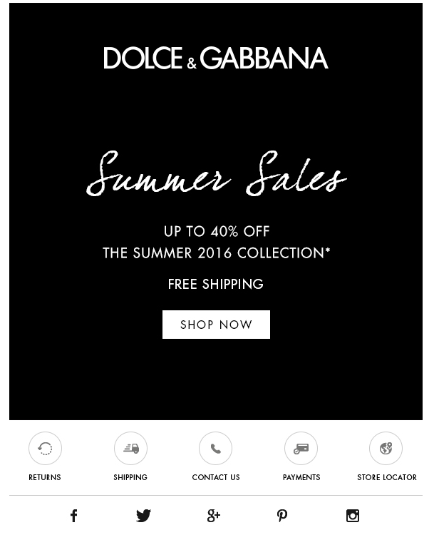
Elegant black
In the world of fashion, black is often equated with elegance. In this sale announcement, Dolce & Gabbana skipped the red that is often used for sales and kept things simple with black and white.