 Renata Gajoch-Bielecka
created
edited
Your checklist for newsletter sign-up forms that work
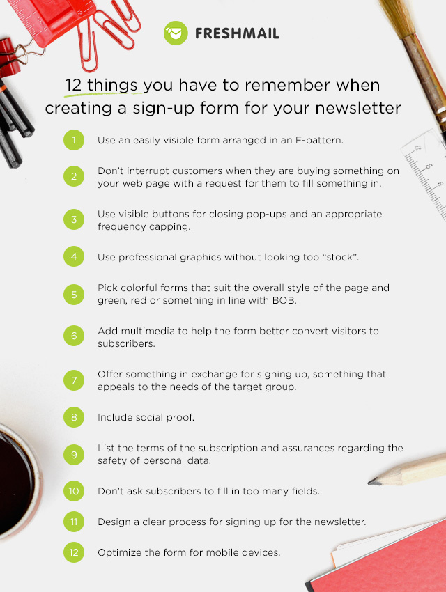
Back to list of articlesNewsletter sign-up forms are often the first impression many customers have of your company or brand. Think of them as an online substitute for a well-decorated office or a smart suit. The design and appearance of your sign-up form will help determine whether or not new subscribers will decide to share their email address with you and give you a chance to engage them with your message. If you haven’t thought about just how important your sign-up form is and what you can do to enhance its effectiveness, then now is the time! Here are a few rules to follow if you want to get the most out of your newsletter sign-up form.
Location, location, location!
Make sure that your sign-up form:
1. Is laid out in an F-pattern to match the natural reading behavior of internet users.
2. Doesn’t interrupt or distract users when they are in the middle of other actions, like placing an order.
3. Has a clear ‘close’ button and is capped at a reasonable number of displays.
Even the most well designed sign-up forms don’t get results if you place it somewhere where no one can see it. When reading online content on a screen, we usually scan it in a pattern that can be seen in the heat maps below. This “F-pattern” servers as a model for the design of online content since it comfortably matches the natural reading habits of internet users. As can been seen in the maps prepared by the Nielsen Group, we start in the upper left hand corner and work our way from left to right and then down and then left to right again but in progressively shorter segments.
An eyetracking heat map on an internet page: www.nngroup.com
However, if you run an online store, you need to be sure that your sign-up form never interferes with the sales process. Place it where it is still visible but doesn’t demand that visitors to your site interrupt their examination of a product or the purchase process.
More aggressive than placing the sign-up form on your website is displaying in the form of a pop-up. It can be displayed after visitors have spend a certain amount of time on a page or after a specific action has been completed, like moving the cursor to the upper right corner as if to close the window.
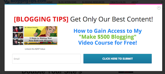
Pop-up sign-up form: BloggingTips.com
Pop-up have to be closed with an additional click that must be made because otherwise further viewing of the page is impossible. If you decide to use a pop-up newsletter subscription form, be sure that you make the ‘close’ button large and visible enough. Don’t give anyone the impression that they must sign up to your newsletter in order to continue viewing a page.
It’s also important that you set the maximum number of times that a pop-up can display, known as “frequency capping”. We suggest that you set it to once per visit for each user and that they pop-up window display a few seconds after arriving on the page. It’s very easy to irritate people if they’ve just started looking over the content on your site and they are immediately bombarded with repeated requests for their email address.
Make it look like something worth signing up for
When you’ve followed points 1-3 above, it’s time to:
4. Make sure your sign-up form only has professional pictures and try not to make them look too “stocky”, as if they were taken from a simple internet search.
5. Design your sign-up form to be aesthetically consistent with the look of your page but use call-to-action buttons that meet BOB standards or are green or red.
6. Enhance the sign-up form with additional multimedia to help it get attention and new subscribers.
A big part of convincing people to join your newsletter is showing that you will properly handle and store their email addresses. You have to begin to convey trust right from the beginning with your sign-up form.
A clean and professional look is especially important when using pop-ups. Internet users are innundated with them daily and are often inclined to ignore them unless they really make an impression.
Studies repeatedly show that using pictures of people helps to improve conversion rates. You can enhance this effect by adding multimedia features like short videos to better show the benefits of signing up to your newsletter. Consider using actual people in your organization instead of obviously stock images to increase the feeling of trust.
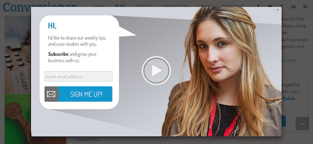
Sign-up form: Conversioner
It’s important to recognize the role of colors in calls-to-action. Research hasn’t found a single color or design that works best but some marketers believe in the power of BOB (Big Orange Button). Then again, others prefer green or red. Try different versions to see what works best for you.
Offer this for that
Now that you’ve got points 4 to 6 down, make sure that you:
7. Offer something useful to your target groups in exchange for signing up to your newsletter.
8. Use social proof.
9. Inform subscribers about the terms of signing up and assure them that their data is safe.
Remember that your challenge is to encourage potential subscribers to sign up to your newsletter and it can often be a difficult task. We are often forced to fill out fields with different bits of information about us in order to advance further and to use parts of a service that we need. Filling out even more fields is not something that many users will be excited about so remember to be smart about how and when you ask for information. Your number one goal is always getting new subscribers to sign up for your newsletter.
Be aware of the language of benefits. For B2C clients, expectations from newsletter are mostly focused on attractive promotional offers and early access to information. B2B customers tend to be more interested in things like insider knowledge or premium content. Depending on the target group, adapt your offer to fit these different needs.
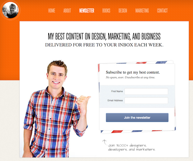
Sign-up form: NathanBarry.com
By sharing their email addresses with you, newsletter subscribers agree to the conditions attached to it, like the frequency of sending. Nobody likes to enter into an agreement where the terms are unclear so make sure you describe them in detail. If you say that you will send messages once or twice a week, then keep to that promise and don’t send an avalanche of emails. Remember that receiving too many messages is one of the main reasons subscribers resign from newsletters.
Email addresses are considered personal information not just by the owners of those addresses but by the law as well. Always follow all applicable regulations regarding the safe and responsible storage of personal data and make it clear to your subscribers that their data is safe and will not be shared with anyone.
Put an emphasis on making it easy
With points 7 to 9 out of the way, now you can focus on:
10. Only asking for relevant information.
11. Being clear on the process for joining your newsletter.
12. Optimizing the sign-up form for mobile devices.
Some say that you only have 8 seconds to take advantage of the attention of someone on the internet. Others put it as low as 3 seconds. Either way, you should follow the rule of three clicks to complete the sign-up process.
The number of fields on your sign-up form should be limited to only those relevant to your business. Data that you gain should be used to personalize your messages so ask yourself if the surname of new subscribers is really necessary. With few exceptions, a first name and an email address is enough to establish a subscriber’s gender and customize all communication with them. If you need to know more, send a welcome message with a link to a preferences center where you can ask for additional information.
If you are collecting addresses according to the Double Opt-in model, be sure to remind new subscribers that they need to click on the link that they receive in their email inboxes - don’t make them have to figure it out on their own.
A report from Forrester about the spread of smartphones and tablets shows how our expectations for online shopping and access to information have changed. We want it now and we want it to be better than ever before. Since more and more visitors are accessing your site from a smartphone or tablet, the design and how it adapts to mobile devices has a greater influence on conversion rates and your bottom line.
Now you have 12 keys to getting the absolute best results from your newsletter sign-up form. Click the button below for this checklist in pdf form to save, print and share!
