 FreshMail
created
edited
Designing a Killer Email Template – A Beginner’s Guide
Back to list of articlesOut of all the available marketing channels, says a recent VentureBeat survey: email is the one, which gathers highest ROI. It is thus imperative to design beautiful emails that work in the favor of your business.
Another research states an astonishing fact - the attention span of an average adult is now just 8 seconds. Isn't that ridiculously less? For email marketers, it only goes to prove that people aren't reading your emails word-by-word but just scanning them to see if there is anything interesting.
So, if you wish to design a killer email template, make sure you are quick at getting to the point and are able to impress your subscriber in whatever little time you have.
Let's take a top to down 'email template designing' approach to make designing easy for you:
Selecting a template
It all begins with choosing the right template for your email. You can either choose one offered by an email template provider or get a template designed by your team. According to Litmus, 56% emails are now opened on mobile devices; and ignoring this would be blasphemy.
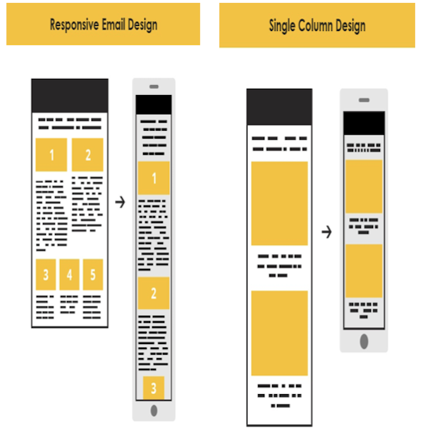
Best is to either go for a single column layout, or design a responsive template.

Go 600px wide
A maximum width of 600px is ideal for your email if you do not wish to annoy your subscribers by making them scroll sideways (horizontally). If you are designing with mobile devices in mind, 320px width is what you should aim at.
Transparency is a requisite
Who are you and what your intention behind sending the email is - these are the 2 things that should be made clear to your subscriber as early as possible in your email. A well-defined sender name and email address (which contains your brand name) along with a personalized, to the point (<50 characters="" subject="" line="" and="" a="" bang-on="" pre-header="" text="" 75-100="" are="" must="" p="">
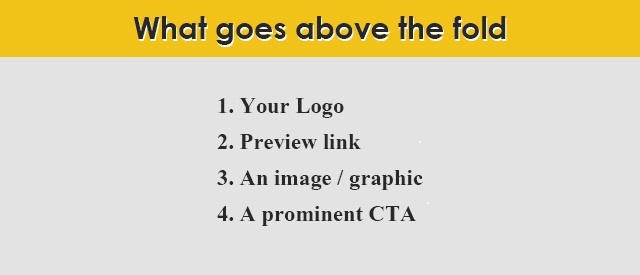
Featuring above the fold
Content placed above the fold (approximately the first 350px length of your email) gets 84% more attention than content placed below it. Make sure you convey your intent in the content above the fold itself and that too in a creative and impressive way.

Writing it right
First and foremost, don't write too much. Your aim is to make your subscribers click on your CTAs. A lengthy copy is a turn-off; no one has the time to read essays in emails.
Write small chunks of content that provoke the subscriber to take action. Keep in mind that adding too much or irrelevant content can also dilute the impact of an email sent with a particular aim.
Images, of course! But let alt-text follow
Many email clients block images as a default setting. So unless your subscriber has opted in to open images, they will not be able to see them. Back-up your images with alt-text, and yes, make sure you do not include important content in images.
A clutter-free design
Leaving whitespace around elements is highly essential or it may look cluttered. You may have highlighted the important elements but it is the whitespace which plays an important role in drawing attention towards them. In the end, make sure everything ties well together.
Building a bond through links
Your social media page links must find a place in the email design or email signature. They are the link points between subscribers and your brand. Another cool way of building a bond with subscribers is by integrating live feeds for Instagram, Facebook, Twitter, etc.
Litmus added a live twitter feed in their email:

Signing off and how!
Sign off with a stunning email signature that will only compliment your overall email design. A good email signature can be simple, informative, professional yet creative, and generally includes name, job title, company name, contact number, address, email address, and social media links.
Letting them go
An unsubscribe link is a must, moreover, it should be prominent. Do not try to hide by using a small or light font. If your subscriber wants to go, let them go; forcing them to stay is going to do you no good.
Time to test
Last but not the least, NEVER forget to test your killer emails across all devices and email clients before you send them to your subscribers.
ADDING THAT EXTRA ZING
Fonts- Fancy or Not
An email should not have more than 3 types of fonts. It's best to stick to web safe fonts - Arial, Verdana and Times New Roman, which are default fonts across various operating systems. Same is the case with font color - 3 or lesser. You can always add a light background color to enhance the effect of elements in your email.
If you wish to experiment a little and invest a little more time, you must try designing web fonts, which allow for more creativity. This way, you can STAND OUT from the crowd.
Interactivity that Inspires
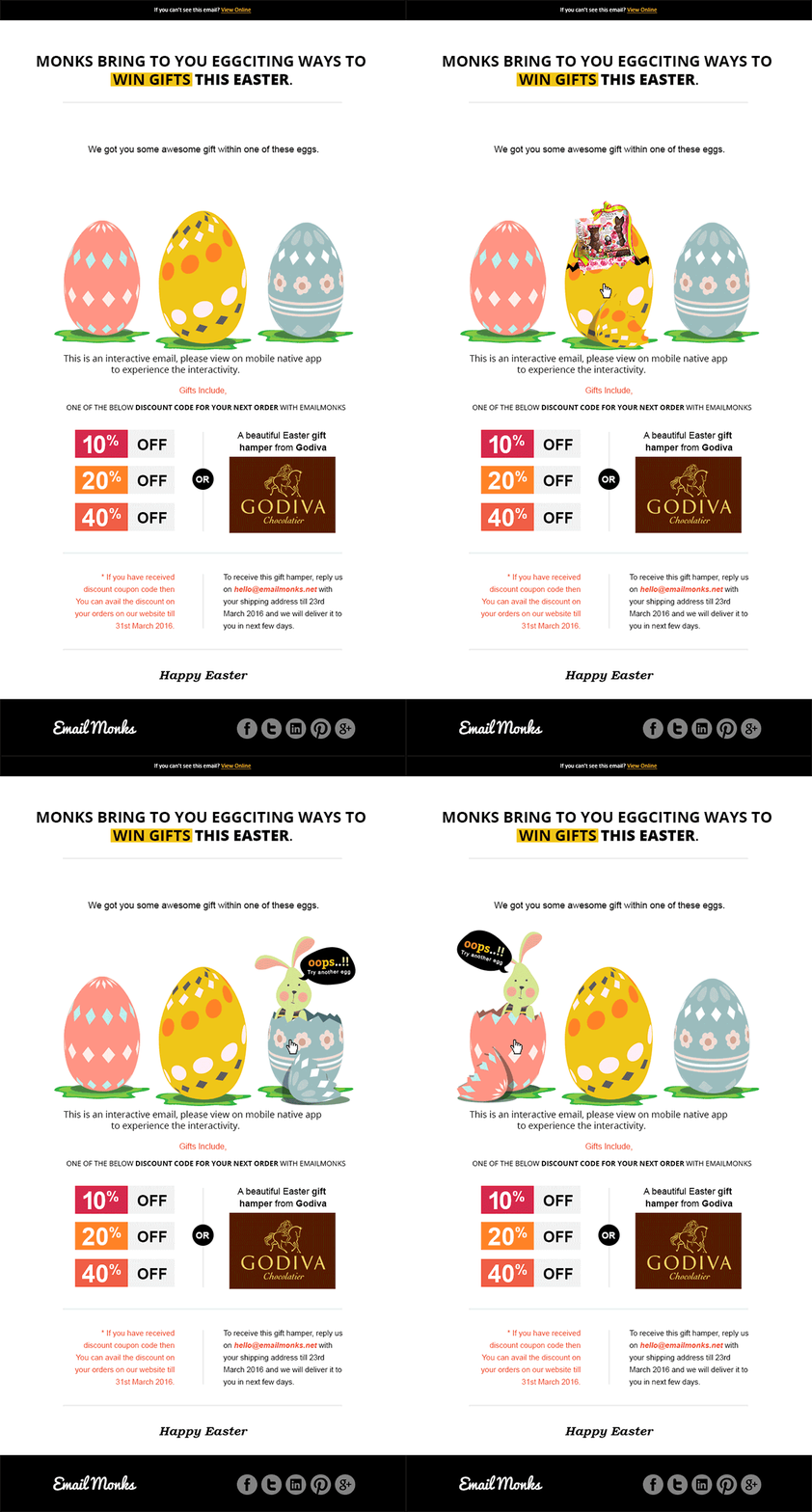
Interactivity in email is the in thing. GIFs, menus, Countdown Timers, Accordions, Rotational Banners, Sliders, Scratch & Flip effect - there are so many elements that can create magic for you. Also, fortunately, many email clients are now supporting interactivity in emails; you must take the early bird advantage and create out-of-the-box emails.
Emailmonks used flip effect in their Easter email:

Wrap-Up
Designing a killer email needs a lot of hard work but if you follow the tips mentioned above, you will certainly end up with an amazing one. Here are the main ingredients of the recipe for designing a killer email template:
- Choose an appropriate template
- Don't exceed the 600px width
- Refrain from hiding your identity and intention
- Logo, link, image, CTA - set them above the fold
- Crisp, to-the-point content scores a 10/10
- Provide an alt text for your images
- Let interactivity liven your email

