 Renata Gajoch-Bielecka
created
[Checklist] 10 steps to a great newsletter
Back to list of articlesYou probably already know that the returns on email marketing are among the highest of any promotional tool. Email is one of the most effective and profitable online channels and it needs to be part of your advertising strategy if it isn’t already.
What can sending newsletters to your own database do you for you and is it hard to get started?
We’ve put together this checklist to help you quickly and easily put great newsletter together and jump into email marketing with our help. Let’s start at the beginning….
Getting ready
When starting out, be sure that you have everything that you need to make a professional newsletter. Of course I’m referring to the tools and materials that you need to make an attractive design that easily coasts through spam filters.
[Checklist] 10 steps to a great newsletter Click to Tweet
Like other marketing messages, newsletters should meet a defined goal. Make sure that you have a strategy from the very beginning so you can define goals for what you want your newsletter to do.
Be sure that you have everything listed on our checklist so you can make and send the best newsletters possible.
Set the goal of the newsletter and the target group
Your message can take many forms, depending on what goal you set for it. Some goals are easy and obvious and complement each other:
- I want my newsletter to generate new sales,
- I want to promote awareness of my brand
Others are too different and varied to go in the same message:
- I want to sell x number of seats at a conference,
- I want to invite x number of people to fill out a survey,
- I want to remind everyone to follow my blog.
In this case, you can overwhelm subscribers with so much information and so many links that they’ll simply choose to ignore all of them.
Among others, goals for your newsletter can include:
- Gaining new customers who previously only visited your website,
- Increasing the number of downloads for something,
- Promoting customer engagement,
- Building your brand image,
- Increasing sales,
- Educating the market,
- Increasing traffic on your website.
Choose the one you want and combine it with demographic and behavioural information you have about your subscribers and then appeal to their needs and interests.
It’s easier to adapt your message to your audience when you know, that for example, men and women have different online buying patterns as well as other factors that can influence your chances of a conversion.
Research from GetApp, shows that both genders sign up newsletters for different reasons. Women are attracted to access to discounts and special offers whereas men place a higher value on news about the brand.
Decide what kind of content and graphics are needed
When you know who your audience is and what you want to communicate in your newsletter, it’s time to choose the words and images you will use.
This is particularly true if you are promoting a gender-based product or service since your message needs to have the appropriate vocabulary and color schemes.
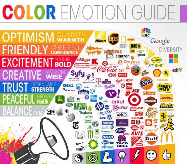
The use of the wrong colors and graphics can quicky tell subscribers that you didn’t bother to customise your message for them. Some colors simpy are not appropriate for every occasion.
There’s a reason you don’t use pink in an automotive business and dull, dark tones for cosmetics.
Your design will also depend on whether your newsletter is aimed at B2C or B2B clients. For B2B, more direct, text-oriented designs are more effective and should include practical information in the form of a report or case study.
B2C subscribers are typically more interested in information about discounts or special promotions and expect a more graphically-oriented presentation.
Remember that a professional-looking newsletter is within the reach of even the most modest budget.
Make use of graphic libraries that are offered by certain email marketing systems. You’ll read more about them in the following points as well as about free resources for professional pictures that you can read about in our report on finding free graphics.
Choose an email marketing system
At FreshMail we are often asked how to choose the best system for email marketing based on the needs of a given user.
When you know what you want to include in your newsletter and to whom you want to direct it, it’s time to find an email marketing system that will help you to reach your goal.
The first thing you should consider is your skills:
- Can you code a newsletter so that it complies with the standards of spam filters
- Can you edit graphics to make them appear as they should in your design?
If you can’t do these things on your own, you need a system that does them quickly and without demanding too much from you.
Haven't choose an email marketing software yet?
This is how FreshMail Designer works. You can compose responsive newsletters using the drag and drop method based on using simple blocks.
There’s also an extensive library of ready-made newsletter templates and graphics that you can use to enrich your design.
This means that you don’t have to know how to code or edit graphics in order to create a great-looking professional newsletter.
If you’re still not sure how to choose the right platform for you, take a look at our guide on how to choose an email marketing system.
Creating a newsletter from the ground up
Sender name
This is one of the key factors, along with the message subject, that allow subscribers to quickly decide if they want to open a certain message and if it’s worth spending the time to read it.
That’s why the sender name shouldn’t be changed after subscribers have become used to it from previous messages unless there is a very good reason for doing so.
The sender field should be personalised and easy to recognise and remember.
![]()
Avoid general addresses that are associated with automatically-generated communication like “info@company.com” or “noreply@company.com”, especially since it sets off anti-spam filters.
A sender name that is easy to identify tells recipients who they are communicating with and reassures them about opening the message. When your messages get opened, it’s a positive signal for email service providers that helps in you in the future.
These are good examples of ideal sender names:
- Mike Adams (as a sender using his own name to communicate with subscribers)
- Mike from FreshMail (as someone communicating in the name of the company he represents)
Remember that not every email address can be used in the sender field. If you’re using an address from a free service, like mike@gmail.com, it will result in a significant decrease in the deliverability of your campaign so it’s best to invest in an address in your own domain.
Message subject
The message subject should be clear, simple and framed in the language of benefits in order to persuade recipients to open the mail.
It’s also a good idea to sometimes include something a little different and interesting like an incomplete sentence to spark interest and curiosity.
Be careful about including information that’s not found in the actual text of the message since it can result in resignations from your subscriber list or in having your campaigns marked as spam.
Remember to also avoid words, phrases and signs that can cause your message to be flagged by anti-spam filters. Don’t use too many exclamation points or question marks, too many capital letters or symbols like “$”. These often get the attention of spam filters.
As the results of a survey by Alchemy Worx show, newsletters with titles of under 60 characters are opened most.
To more attention, add a symbol at the beginning of the subject line that is connected to the message content. See how to do it here.
To make everything even more effective, you can run A/B tests on your campaigns.
Your email marketing system sends the same message with two different subject lines to two parts of your subscriber database. The one that performs best gets sent to everyone else.
Targeted campaigns
Sending generic newsletters with the same content to everyone on your mailing list is not good way to manage your customer communication. One size does not fit all when it comes to sending commercial communications through email marketing systems. Not only do your subscribers lose interest in your message, but they can also mark your emails as spam.
Before you send your campaign, be sure that you know who your target audience is.
Segmentation helps you to achieve this by dividing your subscribers into groups with common characteristics like gender, purchase history or other variables that make them more likely to prefer one kind of content over another.
Campaigns sent to the appropriately segmented list of subscribers achieve much higher open rates and CTRs than those that don’t use segmentation.
- Declarative data like place of residence or age that you can collect in additional fields on your newsletter
- Behavioural data consisting of the activities of subscribers when engaging with you, like messages they opened and links they clicked on
- Data from Email Marketing Automation that lets you send campaigns in response to certain actions completed by subscribers on your site
Newsletter design
If you’ve made it to the design stage, you definitely know if you’re sending a B2B or B2C letter or if you’re targeting a certain segment of your database.
This is when you take the text and graphics that you have and create a coherent whole what will be visually interesting and convince recipients to click on a certain link and take specific steps, like making a purchase.
No matter if you create a graphic newsletter or one with text only, you have to follow certain universal rules that keep your newsletter away from spam filters and guide them safely to subscriber inboxes.
An important part of any newsletter is the “above the fold” area. It’s a rectangle 350 pixels high and 650 pixels wide. This is the part of the newsletter that displays in most email inboxes immediately after the message is opened without having to scroll down.
This is where you have to place the newsletter elements that have the strongest influence on how effective your campaign will be. I’ll describe it now, starting with the first elements of the message that recipients see.
Preheader
The first sentence that email programs display in the content of an email, right after the message subject. If you don’t supply text for it, your subscribers will see something along the lines of:
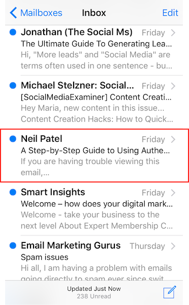
Don’t waste the potential of your message by letting subscribers see something like this. Use the preheader to include information that will interest recipients and encourage them to open the message, like, for example, “click”, “check”, etc.
Perheaders don’t have to be visible in the design, you can always add it in color in the background of the newsletter so it’s only readable by email programs.
Preview link
This is a linked fragment of text at the beginning of the newsletter that lets subscribers display the newsletter in a new browser window.

Source: Swarovski
This is an obligatory element that you need to improve the effectiveness of your message. It it doesn’t display properly for whatever reason, subscribers have another chance to see it.
Your logo
Adding the logo of your business at the beginning of a newsletter influences how recognised it is and at the same time helps your future messages as well by serving as a familiar element of your messages.
Eye-tracking research from Edisonda tells us that placing the logo in the upper left corner of the newsletter is the fastest way to attract subscriber attention.
Call-to-action
Calls to action are often in the form of graphic buttons linked to a landing page that anyone who clicks on the CTA will be taken to.
Email marketing good practices tell us that the first CTA should be placed above the fold so recipients can see it after opening the message.
Don’t use more than three CTAs in one newsletter because it can cause chaos in the communication and lead to confusion about which link leads to what.
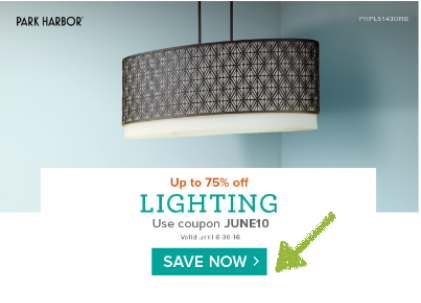
Source: Park Harbor
Heat map analysis tells us that when CTA are placed in areas of interest, subscribers click on other links around the CTA as well.
It’s a good idea to link the entire design, not just the CTA.
See what an effective call to action should contain and how to design it yourself.
Landing Page
Landing pages are where subscribers are taken after clicking on a link in an email and should also be designed in a way that makes it clear to subscribers what they should do and how to do it.
Landing pages have one goal, so be sure that a poorly designed landing pages doesn’t bring down your conversion rate.
One #landingpage is always a one goal to achieve #emailmarketing Click to Tweet
Graphics used in newsletters
Not all email service providers display graphics placed in newsletters. When this happens, it badly damages the chances that recipients will be persuaded to buy anything.
You can deal with this problem by adding ALTs to each graphic, a piece of alternative text that will appear in the place of a missing graphic. The text can be something like this:
Download graphics and see our new collection for yourself
The main purpose of ALTs is to encourage subscribers to download newsletter graphics, here are a few creative ideas for how to do it.
Regarding the graphics themselves, remember that anti-spam filters are very sensitive to their size so be sure that they are balanced by text.
As the largest part of your message, you can make graphics more spam filter-friendly by cutting them down.
When you have to edit graphics, make sure they are balanced more or less evenly with the text content of your message. Use the message footer to help balance things out if needed.
Newsletters shouldn’t be more than 400kb. In the case of Gmail, messages larger than 140kb can cause problems with proper display.
See also our post on what role the use of fonts plays in newsletters and how to use the right colours to increase their effectiveness.
Arranging content in your newsletter
The way you arrange the content of your newsletter has a huge influence on a recipient’s first impression and whether or not they will continue reading.
Avoid having too many columns of information that divide attention and be sure to separate different elements using white space.
You can achieve a similar effect using the right color background in certain elements.
Research carried out by psychologist Alan Baddeley confirms that subscribers are able remember at most four elements of a message at once. That’s why the about of news in one message shouldn’t exceed this amount in order to be effective.
The content of your message should consist of:
- Header,
- Graphics,
- A clear call to action.
Personalised newsletter content
By using the appropriate tags, content in newsletters can be automatically changed depending on what information about subscribers you gather from information in additional fields or from other systems that collect data.
Tags can generate defined text or graphic content. It can be, for example, the name of the subscriber or their most recent purchase.
Social media buttons
It’s important that you make it easy for subscribers to jump to your social media presence.
It’s a good idea to link to particular social media posts that are connected with content sent in your newsletter or somehow complement them.
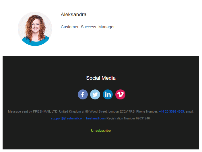
Adding social media buttons in your newsletter increases the chances that you can start multichannel communication with your subscribers.
Footer
This is the field at the bottom of the newsletter where you can add important information about your business to confirm for subscribers that you are in fact its source and to make it easy to get in touch with you. Be sure to include both physical and online addresses.
You can use footers to ask subscribers to add your address to trusted contacts in order to increase the likelihood that your message will not be directed to spam folders.
Resignation link
Adding a resignation link to every newsletter is absolutely obligatory. This is how you make it easy for anyone wishing to leave your mailing to do so and keep with the principles of permission marketing.
Also, you protect your reputation as a sender of messages by not provoking subscribers into labeling your messages as spam when they don’t have an easy option to simply resign from your newsletter.
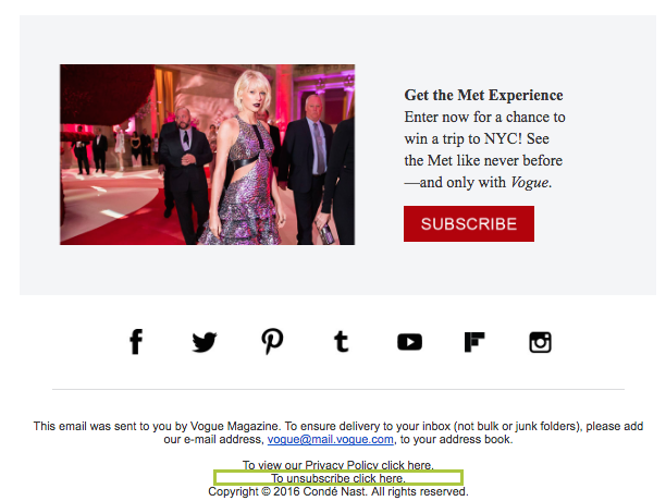
Source: Vogue
On top all that, spam filters look for a resignation link in every newsletter and will block most messages that don’t have them.
Sending on the right day and time
The same campaign sent on different days and different times can bring completely different results.
This happens when your subscribers are busy with other things when they receive your message. They can simply overlook your message when it is surrounded by many others in their inboxes or not have time to get back to it.
That’s why it’s important to identify the best days and times to send your campaigns.
According to the IAB Internet 2015/2016 report, the most popular days for sending email marketing campaigns are Tuesdays and Wednesdays. This could be a point of reference for you.
If you want to be sure about what days work best for you, use a sending time optimiser to find out when best to engage your subscribers.
Test campaigns
If you’re read our blog before you know that we always remind everyone to test every newsletter before sending it out.
Doing so increases your chances of reaching your subscribers’ inboxes rather than being directed to spam folders. You also confirm that your message will display as you intended when subscribers open it.
Beginners to email marketing are risking a lot by skipping the testing stage of campaign creation. Always check everything before you hit “send”!
Analyzing campaign reports
As Dan Zarella says:
The same applies to email marketing. Not only are you putting yourself in danger, you can’t know what to improve to get better results, what to keep doing and what to stop.
See what the most important variables are in campaign reports and what conclusions you can draw from them.
Careful analysis of your results tells you what’s working for you and what isn’t. Use this information to make your next campaign more effective!


